Tuesday, 10 January 2012

How to: use nail guides for various styles

In my last post I mentioned using nail guides to recreate the 30s-40s half moon manicure.  I don't know if you've seen nail  guides, they are basically stickers you can use to help you with creating the perfect French manicure. I thought it'd be nice to write about them since I don't think they get enough love. They seem a bit unnecessary, but they can be a great help. 

Nail guides come in sheets like this. They are very well separated and are made of a thin plastic which means they don't rip easily, they can however stretch and lose their shape if you are too rough with them. The ones I have are classic oval shaped, but I have seen them in many other shapes, straight, toothed, wavy etc.
Before I place them on my nail, I prefer to put them on my hand to get most of the glue off. If I stick them straight on the nail, chances are they will stick on too well on and I'll ruin the mani when I try to remove them as I'll have to aply more force to take them off. Like this there's enough glue left on to stay in place and they are very easy to take off. 
 
And here is how you can use them. On the left is what I did to achieve the 30s-40s half moon manicure and on the right is how you could use them for a French manicure (sort of). You paint over them and when they are a little bit dry, you remove them carefully. Knowing when to remove them is important because is you remove them too soon the polish may dent or move and if you remove them too late, when the polish has dried completely, it will break off. I would say that a little over one minute is the right time.

I hope this helped a little! Remember that there's always a learning curve and don't give up!

Happy New Year with a Half-Moon Mani

I know it's a bit late, but I couldn't post the first post of this year without some wishes! I hope you all had a great time during the holidays. I spent most of mine in bed with a flu. Horrible times! 

I wanted to start the year with something absolutely feminine. I needed it after spending so many days looking dreary and I also wanted to try something new along the same feminine theme and here it is! A half-moon manicure with a red-black polish! 

My colour of choice was Barry M - Red Black which I think is the prettiest of all the almost black reds I have because it's the one that leans the least towards burgundy/purple. It just looks like what the name suggests, a red with a lot of black mixed in. Of course I know it's supposed to be a dupe for Chanel - Rouge Noir, but as I have not had the pleasure to try it, I can't attest whether that statement is true. I am sure I will in the future and I'll post an update. It's a comparison I long to make. 

Frankly, I loved it. I didn't think I would like it as much as I did, but it was one of those times that I couldn't stop looking at my nails. I really enjoyed it!

Since it was my first time recreating the Dita Von Teese favourite and I don't have an obvious lunula (the half moon) to paint around it, I decided to use nail guides. You can find a guide on how to do this here. I still had to do some small corrections, but the guides made life easier!

Unfortunately along with the beauty of this colour comes the usual Barry M price that I've mentioned in the past: stained nails. I had told myself I wouldn't keep this mani for more that two days in order to minimise the damage, but it was too pretty to ruin and I kept it on for four days. The results are obvious in the next picture. My nail bed normally is a single pinkish colour with white edges. The base is still the normal colour and the rest, where the polish was, has a yellow disgusting overcast. I need to find a three-free polish like this soon! 

I hope we all have a happy 2012, even if the usual prophets say it will be our last! It won't be the first time they're wrong! 

Tuesday, 20 December 2011

Christmas Mani

I am not particularly festive, mostly cause this year I have to be away from my family during the holidays and won't celebrate much. I decided to do a Christmas themed mani though, just to make use of the themed designs on my nail plates. One thing I have to say is that this many lasted a long long time-more than I had intended to keep it. The pictures I took were on the fourth day of the mani and there's only a bit of tipwear, no cracks. That's Seche Vite top coat for you.

The breakdown:
China Glaze - Jolly Holly
Stargazer - 237 (gold)
Creative - House of Rebels


Thursday, 8 December 2011

Aromatic Navy Blue

Barry M - Navy is a rich true navy blue with super fine blue shimmer that makes it very special. It looks sophisticated and very grown up, but there is a major disadvantage to it; it stains big time. In the two years I've had it I've only worn it five times (this being the fifth), four of which within the first month after I got it. My nails by the end of that month were yellow and horrible which is something I had never had before. And yes, I was wearing a base coat under it. I often like to have my nails bare and back then I simply couldn't because they looked disgusting! 

I had really missed it, however, and I have yet to find a navy blue as vibrant and cool so I decided I would only wear it for 2 days and I would use an extra coat of a sheer polish over my top coat to keep my nails doubly protected. Here it is!

Fluorescent light

Then the next day I noticed an uncanny similarity between my polish and the lid of my Guerlain Shalimar perfume. The fine shimmer makes the polish look like a metallic sheet on your nails, and it is a couple of tones more cool than Shalimar. They are unquestionably pretty together though!

Natural light (cloudy)

Wednesday, 7 December 2011

Comparison: Dirty Greens

Since I have a few colours that seem to belong roughly in the same dirty turquoisy/greeny group I thought people might find a comparison useful. The polishes I compared are:

  • O.P.I - Mermaid's Tears
  • China Glaze  - For Audrey
  • Etude House - V.V.I.P.Green
  • Misa - Dirty, Sexy, Money
Bottle pictures

Fluorescent light
Natural Light


Opalescence

I have been looking for a polish that would look opalescent, which in my mind means that it should be

  • sheer, but buildable
  • not too peachy, not too pink, not too yellow
  • leaning towards white, but not too stark/contrasting to my skin colour 
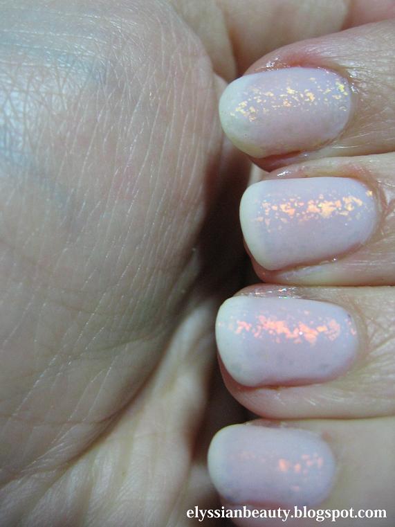
and after a lot of disappointments I finally found what I was looking for in Color Club - Oh my Versailles! and how I adore it! I was drawn to it cause of the name since the Palace of Versailles is one of my favourite places to be, and I was so happy it was exactly what I was hoping it would be.

This is four layers of it with the flaky beauty of Nubar - 2010 on top.
Natural light

Fluorescent light

Along came my darling Manglaze - Matte-Astrophe to make everything perfect!!


And here's a couple of pictures from my visit in Versailles. One from behind the Belvedere and the statue of Eros in the garden near the Trianon.


Wednesday, 30 November 2011

The reason I stopped buying red nail polish...

...is that I always end up with the same blue-based red colour! I love it and I am always drawn to it and in fact I have another two that are exactly this colour, but they are much older so I didn't include them in the comparison. Instead I thought that a comparison between these two Essie colours would be much more useful to you my dear reader.

The first one is Essie - Fishnet Stockings. I think it's from their standard line and it's as classic as a classic red can get. I think it's most famous for being one of Dita Von Teese's favourite polishes and it's no wonder as it is gorgeous and so flattering. It's a creamy polish and very pigmented; with careful application you can even get away with only one coat and in spite of the pigmentation, it's not too much of a nightmare to remove. One of the most stricking things about this polish is that in lower light settings it looks a lot darker than any of this type of reds, so much so that I felt complelled to swatch it next to Ciaté - Dangerous Affair, but they are not as similar as I thought. 

The second one is Essie - Limited Addiction. LA is Fishnet Stockings' almost jelly sister. It's the same colour as you'll see, a gorgeous bold red that demands to be called "feminine", only it has more depth due to its almost jellish nature. It was part of the Fall 2010 collection, it needs about 3 coats for a good coverage, but it does make a good mess when removed so be very careful with it.

Enough with the chit-chat, on to the pictures!

One coat - Fluorescent light
Two coats - Fluorescent light
Fishnet Stockings 2 coats/Limited Addiction 3 coats - Natural Light
Bottle pictures - Natural Light

As I mentioned earlier, I thought it would be a good idea to add swatches of them next to more reds and I picked Creative Nail Design (CND) - House of Rebels and Ciaté - Dangerous Affair. One is lighter and the other is darker. Excuse the sloppy application. I was really tired and had already swatched a lot of polishes that day. Look at my poor cuticles, so dry from the acetone.
Fluorescent Light
Bottle Shots - Fluorescent Light


Sunday, 27 November 2011

Kim Hyun Joong's Shirt

My dear friend, who for all intents and purposes shall be called Patrick Starfish, was bombarding me with images of Korean guys yesterday. Many of my friends have that as a hobby it seems. Aside for the fact that they are all gorgeous, they also wear gorgeous clothes. Everything can provide me with inspiration and in this case it was Kim Hyun Joong's shirt. This one is for you Patrick Starfish!

The detail:
1 coat of Nailtek base
2 coats of China Glaze - Aqua baby
1 coat of INM Out the Door topcoat
Konad plate m60
Le Chat CM Nail Art Polish  - 4 Brown

1 coat of INM Out the Door topcoat


I didn't really do a great job in this and I managed to ruin the design a bit when I was doing the clean up. This top coat is starting to bug me as well because whatever I do, it drags the design. Oh well! Disce ut semper victurus!

Related Posts Plugin for WordPress, Blogger...