Saturday, 26 November 2011

Bronze Green Perfection


I was looking for a green polish that has the quality of oxidized bronze/copper. I have always found that green-blue mix of colours captivating and fascinating. In fact I want an enormous garden with baroque bronze statues that I can run around and be happy forever. These colours will add to the beauty of the garden!

Trying to find that quality in a nail polish is hard, but at least I managed to find the right green. Here it is next to a bronze necklace I bought from asos.  This is two coats of Mavala 155 Bronze Green stamped with that beige/yellow/gold polish I mentioned here and a design from konad plate m15 and Seche Vite top coat.

Mavala polishes are of great quality, however I find that most people (including myself) are discouraged by the current price they are asked to pay in most shops for the quantity (£4.10 for 5ml). I was so lucky to find these in beautybay for just £3. I hope they don't change the price any time soon. 

Friday, 25 November 2011

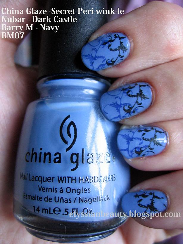
November blues

I couldn't decide which winter colour to wear when I was looking at my pretty bottles and I was drawn by something that doesn't scream 'winter' i.e.dark and warm. If you think about the beautiful Christmas decorations that are almost everywhere right now, it sort of is. Icy blue fairy lights look so magical! I don't like multicoloured lights, but clear and icy blue are so beautiful!

As I don't like colours with too much white or too light on my skin I chose Periwinkle blue; it is cool enough to be icy and not sky blue. Here it is then, China Glaze - Peri-wink-le stamped with a design from bundle monster plate BM07 using Nubar - Dark Castle (the near black) and Barry M - Navy (the dark blue).


Sunday, 20 November 2011

The Illusive Puce Couleur

I hadn't realized I have a favourite winter colour until I noticed that in my wardrobe the ruling colours(other than black) are all variations of the colour puce. In essence it means that they are too red to be plum, too purple/brown to be burgundy and when they are lighter, they are too cool and brown to be dusty pink. Puce(the French word for flea) is an illusive colour that ranges from dirty rose (belly of the flea) to reddish brown with a bit of purple(back of the flea). If you click on the pretty image, you'll get to read some interesting things about the colour that was the height of fashion in the 18th century!
Not many puce coloured polishes are around at the moment since taupes and lilacs is more in fashion. There are "dirty" roses around, but they lean too much towards mauve. I do have two little jems in my collection though that are "puce" enough to make me happy. The first one is Nubar - Mystic Romance;it is a very light dirty rose with the finest lilac sheen. In the bottle you can also see a little green and a little gold, but those colours don't translate on the nail. On the nail it looks like a flattering dirty pink that has a light glow, sort of like the elves in Lord of the Rings. I know it sounds weird, but it is beautiful and the fluorescent lamp on my desk doesn't do it justice.


Excuse the burn mark on my index. Morning porridge accident. 


The next day I decided to stamp it with an arabesque design from the Bundle Monster plate BM20 and I used a medium puce colour, CND - Muddy Rose. Actually 'muddy rose' could be an alternative name to puce and it sounds a lot better that 'well fed flea colour'. Here it is


And to end this rather baroque post, some music!

Saturday, 12 November 2011

Purple Nails: Mononoke's Kusuri Uri

It's geeky time! Following a discussion I had earlier with some friends I was reminded of one of my favourite characters from an animation horror series, Mononoke(モノノ怪)'s Kusuri Uri (薬売り), the Medicine Seller. He is a sort of mysterious psychic detective and amongst other things that add up to make this character amazing, he also sports purple nails and I haven't done purple nails in quite a while so ...


I didn't want to do plain purple though so I did an accent nail where I tried to paint freehand a pattern from his kimono. Here it is: 


The breakdown
OPI - Parlez-vous OPI?
The greenish background is a custom mix of equal parts of Misa - Dirty, Sexy, Money and OPI - Mermaid's tears.
H&M - Moody model (the teal)
Etude House - yellow
The red was a custom mix of Ciate - 138 Snatch and a bit of white. Green cancels red sο it really needed something to make it stand out and a little bit of white was just it. I also picked an orange-based red becuase I didn't want the addition of white to make it look pinkish.  

Too bad the top coat dragged the design a bit! I hope you like it!

Things to Avoid on Evilbay: Nail Art Pens and Pump Dispensers

I do a lot of my polish shopping online and a few times I've given in to buying the ridiculously cheap stuff on ebay to try them out. I think these two have been my greatest disappointments that I can remember and I would strongly discourage anybody from buying them. They are a total waste of money. Both usually have to be sent from Hong Kong/China, but recently I have seen sellers base in the UK, USA and Germany sell them. 


Nail Art Pens
Honestly, they are the most f o u l smelling things you could ever get. I seriously doubt they are safe for your health and -no surprizes there- there is no list of ingredients to check. When I say foul, I don't just mean non 3-free nail polish smell. I mean the smelliest gas pump mixed with industrial strength glue with a bit of exhaust allure. I couldn't even stay in the room when I opened one for the first time, I could feel whatever I inhaled when I opened it for quite a few minutes after. I considere my health far too precious and I am not an asphyxiation enthousiast so I thew them away and -frankly- I feel a bit guilty for having thus poluted the earth. 

Their quantity (they come in lotsof 12/24/60) and their cheap price might make you think that they are a bargain, but they are most definitely not. Your health is far more precious than cheap polish. 

Pump Nail Polish Remover Dispensers
They don't work. Not much to add there, really. I got two and neither worked. On one the pump wasn't working and on the other the remover was ending up anywhere but where it should be. The lids didn't sit properly on the bottle, too, which meant that it all evaporated pretty quickly. A major fail. I will just have to look around Sally's next time for something better.

I hope you've learned from my mistakes! Buy some glitter, throw it around and pretend you are dancing with  Jareth instead! 


Wednesday, 9 November 2011

Cool Dark Green: Nails Inc - Foubert's Place

Back in winterland now I wanted something greyish, but not grey (is it making any sense? haha). Along comes Nails Inc - 470 Foubert's Place to satisfy my craving. It is a very greyed out dirty khaki cream and it dries greyer on the nail than it looks in the bottle. Compared to my other greens and khakis, it looks brownish grey. I think it is the green version of $OPI's Metro Chic. FP is as greenish as MC is purplish and both seem so dirty-pretty. As one would expect, it's very difficult to photograph it. I did my best though!

The application was dreamy and the brush is excellent! In this picture I haven't done a clean up around my nails and I am not usually that good at not making a mess of my cuticles!

Of course this called for a stamping session. I wanted to continue the mediaeval theme and picked a luxurious looking golden stamping polish that I have from Konad. In the bottle it's camel/beige with pretty little yellow to light green shimmer particles. I used Bundle Monster plate BM203 for this one. 


Close up of the shimmer in the bottle. It wasn't too apparent when I stamped it, but as soon as I put on a top coat it came to life! It's brilliant!

Grecian Inspiration: Etude House WH202 & China Glaze - First Mate

Before I made this blog, I used to take pictures of my nails and make up to show to my friends whenever I did something out of the ordinary or when a friend wanted me to swatch and compare some things I have. Scheming through some old pictures I found these pictures taken right before I went to Greece for my holidays. I never wear white polish as I find it too stark, but with a blue stamp covering most of it I loved it! The inspiration for this combination was taken from the designs of the metallic bars in balconies in Greece. I find them so fascinating. Almost no two are the same. 
I miss the summer! 

I used Etude House as a base and China Glaze - First Mate for stamping.


Monday, 7 November 2011

The End of Autumn: Ciaté - Strictly Legal

Ciaté's Strictly Legal is as gorgeous as burgundy colours can get. I don't know why they describe it as a purple on the sight, it looks burgundy to me. The only time you can see hues of purple is when you aply the first layer, but then it changes to this dark beauty. It has tiny golden shimmer particles which you can clearly see in the bottle. On the nail they are much more discreet and sparse and look from slightly pinkish to golden.

Pairing it with gold for stamping was a no-brainer really and they look amazing together. I only wish I could take better pictures to show exactly how pretty they look. It looks like a  mediaeval embroidery piece to me and I always turn to the mediaeval style when it gets chilly!

I also love this Bundle Monster design for this sort of half nail stamping. You'll probably see it often!

A comparison between this and China Glaze's Side Saddle here.

Natural light (shade)

Articificial light

Related Posts Plugin for WordPress, Blogger...