Tuesday, 29 December 2015

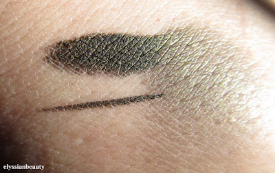
Yves Saint Laurent Eyeliner Effet Faux Cils in 3 Noir Bronze/ Bronze Black


I find that the Christmas holidays are the perfect time to try something a bit shinier, a bit more glamorous than usual. For me that is the Yves Saint Laurent Eyeliner Effet Faux Cils eye liner in 3 Noir Bronze/ Bronze Black. It drew my attention cause I love old gold type of colours and I am glad I got it.

It’s been quite a few years now that I’ve been using exclusively Korean and Japanese eye liners, not only cause of their superb quality, but also because they don’t trigger any of my allergies. There’s only so many times one can try and fail to find an eye liner and mascara in the western market that doesn't trigger any allergies before it all feels like throwing money down the drain.

That’s when I noticed that on the packaging of the YSL eye liner were the magic words: Made in Korea. I have since noticed that the glass jar is exactly the same as my much loved Shu Uemura one(the lids are different of course), they contain the same amount of product(2.8gr) and they are very alike in texture. Given that both brands belong to the same parent company, L’Oreal, chances are they are made in the same factory. It was worth a try!


Whats it like though? It’s a black gel-cream eye liner saturated with bronze shimmer, thus making it look olive green in the jar. If you smudge it out a bit, then the black base becomes more apparent. It is super smooth, it glides on the skin easily, the colour is very opaque so you need only a couple of swipes to get it to look perfect and I’ve worn in for over 10 hours(sans a primer) without experiencing any transfer, smudging, crumbling or anything unpleasant. It almost feels like I have nothing on. On the eye it looks more black than in the jar and the bronze shimmer makes it look so elegant and delightful.

I’ve worn it lots during the holidays and I find it very reliable. It’s a very welcome shimmering addition to my eye liner collection, since most of my other eyeliners are Shu Uemura and their range is all matts. I think I might get the Jade Black next. Emerald green eyeliners are my weak spot!


ΧΧΧ
Elysse

Sunday, 13 December 2015

Pink Ruby with gradient stamping to rid me of my cold

I have many posts waiting in my drafts, but I decided to post this one today since I finished it a little while ago. I really needed a little pick-me-up cause I've had the most annoying cold for the past few days.

The base colour is from a Bulgarian company. I've noticed there are a lot of cosmetics around coming from Bulgaria lately, most of them are pretty inexpensive, too. This could be a fledling trend, who knows. Anyway, Brooklin - 9* is a beautiful metallic pink ruby colour that applied beautifully and was opaque in 2 layers.

On top of it I did a gradient stamp with Her Rose Adagio and Fated Prince by A-England* using the Drikk DRK-B plate. This was a little bit more challenging than the gradient stamping I had done before since so far I had only done a gradient using similar colours and tones.

the bottles are so similar
My mani-cure (I am really not well, I am making terrible puns!) is not bringing my voice back, but at least I can stare at my pretty bejewelled nails now. On to some soup and a few episodes of 'Bob's Burgers'.
xxx
Elysse
*All the links in this post are non-affiliated links.

Friday, 11 December 2015

Apivita Lip Care in Pink Rose, Pomegranate and Blackcurrant

Ιn the past I have written about how much I love the Apivita lip balms. I’ve loved them for well over 20 years now and this time I have the old packaging to show you as well. The first one I bought was the cocoa butter one and as soon as pre-teen me could muster the courage, I got the rose one. It was my first lip product with colour and I can still remember how excited I was, applying too much so that I could carefully blot it like I had seen my mother do with her lipstick.
90s packaging
The number of lip balm bullets I have used up is impossible to count, they are a true staple product for me. This time I’ve selected the three lip balms that leave some colour on, the pink rose, the pomegranate and the blackcurrant. All three are very hydrating, but what I appreciate more is that my lips don’t feel hydrated only when I have them on, they are in a great condition hours after I’ve applied the lip care and the more consistently I use them, the better they look.
According to the website all three are made with olive oil, beeswax, cocoa butter, shea butter, castor oil and jojoba esters. They also contain vitamins E, C & F, avocado oil and calendula. They are created with  96-99% organic ingredients and are cruelty free. They are also free of silicone, parabens, propylene glycol and mineral oils. You can check the list of ingredients here: pink rose, pomegranate and blackcurrant.*

What are the differences between the three of them though? I would say they are different in terms of how much colour they leave on and how matte or shiny they are.

The blackcurrant lip care is the most pigmented one. It leaves the lips looking a bit deeper than their natural colour, a deeper rose colour and it is also the shiniest of the lot. It’s perfect for those days when it’s so cold that your lips loose all colour. I had also suggested it to a friend of mine whose lips had become really dry and colourless as a side effect of chemotherapy and she liked it a lot.

The pomegranate, though it looks almost colourless on my hand, has a brightening effect on my natural lip colour. It is more on the matte side giving the lips a very natural texture and it smells amazing. The website mentions a “red fruit scent” which I would have guessed would be more of a “forest fruits” scent, but (luckily for me) is more of an unripe pomegranate, sweet and zingy. A unique and pleasant scent.

The pink rose lip care is the least pigmented, leaving behind a pale pink colour. My lips are naturally pigmented so I only wear this when I want to tone down their colour a tiny bit. It is the most matte of all, so perfect for the summer months where every other lip balm seems to melt. It smells of rose and geranium, a bit like a turkish delight.
Their price is 4.95€ for 4.4gr of product.

Last but not least, it’s only a few hours till my giveaway ends and one of the prizes is an Apivita lip balm so those of you who want to try it, don’t forget to take part!


xxx

Elysse


*All the links are non-affiliated.

Tuesday, 1 December 2015

Christmas Blog Giveaway! (closed)

It’s time! I promised you a giveaway and here it is! It’s the first time I host a giveaway or use rafflecopter so I hope I did everything right! The giveaway is open worldwide, please read the Terms & Conditions!
a Rafflecopter giveaway


The winner will be getting 8 polishes and a lip balm of a total value of about 60€. All of them were bought by me.In detail they are:
Six Korres Nail Colours in 01 Cream White (for all your snowy needs), 36 Light Peach, 38 Bright Mint, 74 Violet, 79 Metallic Purple, 97Steel Grey. You will find a review on some of these colours here and here. I tried to get 2 lights, 2 mediums and 2 darks to keep everyone happy.
Flormar in 392 Holographic Silver (the one I write about here) and GL06 a chunky green glitter with holographic stars in a clear base, it doesn’t get more Christmas-y than this polish!

And last but not least, the Apivita lip care in Pomegranate. I will be posting about these amazing products within the next few days, I just didn’t want to delay the giveaway. The short story is I love them. I picked ‘Pomegranate’ because pomegranates have been a good luck symbol in Greece since ancient times and it’s actually traditional to break a pomegranate at the entrance of the house on new year’s day. It’s a “Happy New Year” wish in lip balm form!

Good luck everybody!
xxx
Elysse

Sunday, 29 November 2015

Korres Nail Colour Mega review - part2: The Cool Gang

What did you think of the warmer colours on the first part? Now it's time for the blues, the greens and the purples! 

72 – Spring Lilac: A beautiful greyed lilac colour, lighter that O.P.I.’s Done out in Deco which looks lavender in comparison, darker and more robust than Orly’s Bon Bon. Perfect in two layers.
82 – Ciel: a sky blue with a little bit of grey in, to mute it a bit so that it’s not too vibrant whilst remaining a beautiful azure shade. It has a bit of silver blue sheen, but you can only detect it if you know it’s there. With 2 layers there’s a bit of VNL, 3 layers and it’s opaque. 
89 – Blueberry: this is another stand out colour. A muted blurple (do bloggers still use this term?). I like these colours in general, but I didn't expect how much I was going to like wearing it. Perfect in two coats.


Korres’greens are some of the best I’ve got in my collection. The ony I had before was also a green and there’s a reason why I picked another 3 greens from this brand. Such wearable colours!
35 – Pastel Mint: a greyed yellow-leaning mint, not a chalky pastel, and I was quite surprised that it did not give me lobster-hands. Unfortunately my camera decided I should have them anyway, so don’t be disheartened by the way it looks in the pictures. It needs three thin layers for full opacity. It doesn't apply as nicely as the rest of the colours, but that's a universal pastel problem I think.
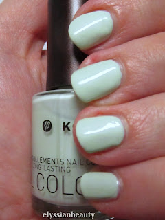
38 – Bright Mint: a goddess amongst my many mint polishes which is why I have included it in my giveaway. It has the Korres golden sheen, but it does register as gold at certain angles. A cool mint that is opaque in 2 layers.
90 – Pale Green: I have so much love for this one! It’s a smooth grey-green cream that applies like a dream. I would call it Misa’s Dirty, Sexy, Money’s lighter cousin. Perfect in two layers.


83 – Denim Blue is one of those polishes where the first layer applies too light and you think it’s going to need another two at least, but with the second layer it’s fully opaque and you’re left wondering how this magic happened. It’s somewhere between a navy and a midnight blue. In the bottle you can see a silver sheen, but not on the nail. It also didn't stain at all and since I wore it recently I can tell you it lasted a full five days without a top coat and had no chips or anything.

79 – Metallic Purple is not metallic at all, not in the traditional sense. It is a very red-leaning purple with a complex blue with pink particles flash. It’s like you’re wearing Venetian glass to be honest, it has that luminescent quality without an obvious metallic sheen. This is also going to be in the giveaway.
96 – Paradise Green: when I wore this colour I felt like a mermaid in the winter. It’s a teal base with green shimmer that depending on the angle can look almost teal. It was very difficult to photograph it and I wasn’t 100% successful. There is a very slight VNL with 2 layers, but not enough to necessitate a third layer.

I have to say that since I took this pictures I bought another 3 on a sale! They will certainly appear here in the future. So, what did you think of them? Any of them got your attention?
xxx
Elysse.

Saturday, 28 November 2015

Korres Nail Colour Mega review - part1 (picture heavy)

I had reviewed a nail polish by Korres in the past, but since then my collection has grown a lot which is a testament to how fond I am of them. After I finish presenting all 21 of them I will finally announce my first giveaway.Yay


Some general points about these polishes:
  • They are perfect for those looking for more muted tones. Their more winter colours have a characteristic and unmistakable muted quality to them which makes even the more unusual colours look very chic and wearable.
  • They are 7- free, i.e. they contain no silicone, acetone, phthalate, formaldehyde, camphor, tuolene and xylene. Their smell is really inoffensive, there’s hardly any of it. They also contain myrrh extract, provitamin B5, and oligoelements.
  • Each bottle contains 11ml and the brush is medium sized and flat, not as bit as an O.P.I. brush, more like an Etude House one.
  • Their formula feels different to other polishes, they are easy to control, apply very smooth and level very well. They don’t tend to pool at the sides at all even when I applied a thick layer (see the yellow below).
  • They are easy to remove and do not stain the nail.
  • All pictures were taken without a top coat.

All of them were bought with my own money. You can find more of them at the company website (non-affiliated link).

47 – Apricot: in the bottle in looked more pastel, but it a dries a little darker, to very cute apricot colour. It’s a cream that levels nicely when applied and requires 3 thin layers for full opacity.
13 – Sweet Pink: a salmon pink with the familiar silver sheen. It feels very romantic and autumnal. Opaque in two layers.
34 – Pastel Lemon: as with most yellows, this is applies a bit patchy. It’s the only one of the lot that I had any problems with though it was fine with 3 layers. It also has a sheen put it’s completely undetectable.
The golden sheen is apparent in the bottle, on the nail it's a different story.
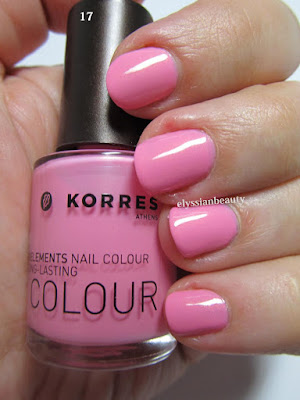
17 – Candy Pink: the most appropriate name for this vibrant blue toned pink. It has a slight golden sheen that is very typical of Korres’nail polish, but in this case it is not really visible on the nail. It needs three thin layers to reach full opacity.
22 – Flashy Fuchsia: again, a very correctly named colour. It, too, has the golden sheen only in this case it is more visible, but not distracting from the colour. It’s in the same family of colours as Essie’s Rose Bowl, only this is a deeper vibrant colour. Opaque in two layers.
51 – Tempting Coral: this is a jelly-like (a crelly maybe?) polish with the same golden sheen. The sheen is not visible as a golden colour, it just makes the polish more vibrant. A very summery colour, deeper and more orange than both Ciaté Mistress and Snatch and with the same type of opacity. Even with 3 layers on I can detect a VNL, but I still like it for its juicy look.


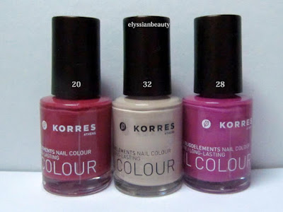
20 – Pink Azalea: a muted berry pink. Perfect in 2 coats and super smooth to apply. There’s also a deeper and redder version of this that I saw in the shop the other day and I know I need to get that, too.
28 – Disco Purple: Another colour that makes you think of the late 70s disco craze. I can’t help but think that this is a nod to the classic YSL Fuchsia. It’s a medium pinky orchid with a pink flash. Opaque in 2 coats.
32 – Light Mocca: this one has a silver sheen, too, but it’s almost undetectable even in the polish. It’s just there so that this beige colour won’t look flat. Three layers for full opacity.
33 - Metallic Sand: a light/medium sand colour. It has a light silver sheen to it that is visible when the light hits it. A good work-safe colour. Opaque in 3 layers.
65 – Metallic Bronze: a medium and rather cool bronze colour. It applied a bit streaky, like metallics do some times. It is such a pigmented colour that you could get away with single coat, though I obviously did two for the swatch.
61 – Metallic Taupe: a silver-brown taupe. 61 is not as streaky as in looks in the picture and it looks more brown under natural light. Opaque in 2 layers. 

I love both 61&65 cause they have a very vintage feel to them with 61 being the late 70s Bianca Jagger in studio 54 kind of colour and 65 being early 80s Crystal Carrington from Dynasty type of colour, equally unique in my collection as colours and textures. 

That's it for today. Tomorrow it's going to be all about the cool colours!
XxX
Elysse
Related Posts Plugin for WordPress, Blogger...