Showing posts with label colour Green. Show all posts

Saturday, 29 October 2016

O.P.I.'s Jade is the new black, the emperor of jades

A bit of fun with a colour I hadn't used in a while!

base: O.P.I. Jade is the new black
marbling: Dorothy L - 213
stamping: Stargazer 237
λεπτομέρειες: A-England - Holy Grail
plate: Born Pretty - L004


Sunday, 29 November 2015

Korres Nail Colour Mega review - part2: The Cool Gang

What did you think of the warmer colours on the first part? Now it's time for the blues, the greens and the purples! 

72 – Spring Lilac: A beautiful greyed lilac colour, lighter that O.P.I.’s Done out in Deco which looks lavender in comparison, darker and more robust than Orly’s Bon Bon. Perfect in two layers.
82 – Ciel: a sky blue with a little bit of grey in, to mute it a bit so that it’s not too vibrant whilst remaining a beautiful azure shade. It has a bit of silver blue sheen, but you can only detect it if you know it’s there. With 2 layers there’s a bit of VNL, 3 layers and it’s opaque. 
89 – Blueberry: this is another stand out colour. A muted blurple (do bloggers still use this term?). I like these colours in general, but I didn't expect how much I was going to like wearing it. Perfect in two coats.


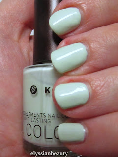
Korres’greens are some of the best I’ve got in my collection. The ony I had before was also a green and there’s a reason why I picked another 3 greens from this brand. Such wearable colours!
35 – Pastel Mint: a greyed yellow-leaning mint, not a chalky pastel, and I was quite surprised that it did not give me lobster-hands. Unfortunately my camera decided I should have them anyway, so don’t be disheartened by the way it looks in the pictures. It needs three thin layers for full opacity. It doesn't apply as nicely as the rest of the colours, but that's a universal pastel problem I think.
38 – Bright Mint: a goddess amongst my many mint polishes which is why I have included it in my giveaway. It has the Korres golden sheen, but it does register as gold at certain angles. A cool mint that is opaque in 2 layers.
90 – Pale Green: I have so much love for this one! It’s a smooth grey-green cream that applies like a dream. I would call it Misa’s Dirty, Sexy, Money’s lighter cousin. Perfect in two layers.


83 – Denim Blue is one of those polishes where the first layer applies too light and you think it’s going to need another two at least, but with the second layer it’s fully opaque and you’re left wondering how this magic happened. It’s somewhere between a navy and a midnight blue. In the bottle you can see a silver sheen, but not on the nail. It also didn't stain at all and since I wore it recently I can tell you it lasted a full five days without a top coat and had no chips or anything.

79 – Metallic Purple is not metallic at all, not in the traditional sense. It is a very red-leaning purple with a complex blue with pink particles flash. It’s like you’re wearing Venetian glass to be honest, it has that luminescent quality without an obvious metallic sheen. This is also going to be in the giveaway.
96 – Paradise Green: when I wore this colour I felt like a mermaid in the winter. It’s a teal base with green shimmer that depending on the angle can look almost teal. It was very difficult to photograph it and I wasn’t 100% successful. There is a very slight VNL with 2 layers, but not enough to necessitate a third layer.

I have to say that since I took this pictures I bought another 3 on a sale! They will certainly appear here in the future. So, what did you think of them? Any of them got your attention?
xxx
Elysse.

Thursday, 9 April 2015

Byzantine influence: O.P.I - Every Month is Oktoberfest & a-England- Dragon

Paris Psalter (BnF MS Grec 139), folio 435v
Another one from the vault of unpublished images, one that takes inspiration from Byzantium this time. Having been raised in Greece anything to do with Byzantium was always connected with religion in an almost oppressive way. It took me quite a few years to see beyond that and appreciate those times and all their cultural output more.

The design of this plate reminded me of the cross-shaped stained glass windows that are so common in orthodox churches. The base is the amazing inky blue with reddish shimmer O.P.I - Every Month is Oktoberfest and the stamping was done with the chameleon of greens a-England - Dragon. I couldn’t believe how different Dragon looked here and how much it shimmered and sparkled. The pictures don’t do it enough justice!

Displaying different colours.


Dragon is so beautiful as a stamp!


Tuesday, 17 September 2013

Flowers from Korea

A few months ago a dear friend of mine went to Korea. She’s one of those people that wherever she goes pleasant surprises happen and they are the stuff we talk and laugh about for years. I wonder what stories she’ll have to share when she comes back from her travels later this week. Along with her amusing stories she also brought back a ton of presents, some of which you will be seeing eventually. Not the chocolates, though. Those are already gone.

One of those presents was a colourful cosmetics bag. I love unusual combinations of colours, and this is definitely a winner combination. It’s one of those combinations that when you hear about it, it sounds like it wouldn’t work, but then you see it and it’s beautiful, vibrant, it makes your day just looking at it! I aim to become brave enough to combine colours that way. 


Something that beautiful of course had to be translated to a mani and here is my attempt, along with the colours I used to achieve it. I chose the plum tree pattern from the Konad plate m66 as the fabric has a similar embossed floral pattern, though you can’t see it in the pictures. The colours I used were (thumb to pinky):

Essie – 563 Bachelorette Bash
Butter London – Dosh
Orly – Everything’s Rosy
OPI – Kyoto Pearl 
Bourjois – 39 Jaune Trendy
Nails Inc – 050 Tower Bridge (for stamping)


Friday, 14 September 2012

Comparison: Dark Blues and Dark Greens

This is one of the oldest comparisons I haven't published since the pictures were taken back in April so excuse the dry cuticles and not very smooth application. I wanted to get Mavala - 251 Cedar Green and Mavala - 247 Mosaic Blue for some time and when I finally got them, I discovered they were exact dupes of colours I already owned, O.P.I. - Here Today...Aragon Tomorrow and Ciaté - 3 am. Girl respectively. All four polishes are great and there's really minimal differences between them.

Mavala - 251 Cedar Green and O.P.I. - Here Today...Aragon Tomorrow are very dark greens. Both require 3 coats for full opacity, though they always retain a certain jelly-ness. Both have a small amount of shimmer in that is barely noticeable in the bottle, but keeps the polish from looking too flat on the nail. The only difference I noticed was that when used for stamping, Cedar Green's pigmentation was smoother.  
Mavala - 247 Mosaic Blue and Ciaté - 3 am. Girl are midnight blues, both require 3 coats for full coverage and, like the previous couple, they have a certain jellyness to them without being true jellies. Mosaic Blue has a bit of the shimmer like the other two, whilst 3am.Girl doesn't. Again the only marked difference was when I used them for stamping where Mosaic Blue is a little bit darker. 

artificial light

with flash

stamping (natural light)


Monday, 6 August 2012

Fuchsias in the Garden

The fuchsias this season are glorious so it was a bit of a no-brainer what my 'In the Garden' manicure was going to be about!

Base colour: Etude House - GR605 
Stamping polish: LeChat CM - True Violet
Plate: Konad m83
Green leaves: Misa - The Grass is Greener on my Side
Flowers: OPI - Kiss me on my Tupils & LeChat CM - Royal Purple
A rare moment of sunny weather


Thursday, 2 August 2012

Dotting tool fun with Etude VIP Girl polishes

The seventh challenge in the Summer Challenge is Dotting Tool Summer Fun and fun I had. I really enjoyed making something this colourful. I don't usually use this many bright colours, but I really felt like making something cheerful today so out came my dotting tools along with the VIP Girl collection from Etude House and this is what I made!
Here is the full collection. Aren't they the cutest? From left to right they are: YL802, GR605, PK011, BL505 and PK012

XX


Friday, 1 June 2012

Drk-A, Westside Warrior and Crop Circles

I've had China Glaze - Westside Warrior for the longest of times and hadn't worn it for some reason so I decided it was about time. It's actually a very nice polish, maybe a little too yellow-leaning for me to love it (I have Foubert's place for that), but the texture is nice and it applies smoothly in two coats.

I also decided to go one step beyond and do the 'dreaded' accent nail for which I used  Bourjois 39 Jaune Trendy and Westside Warrior as a stamping polish using a design from my beloved Drk-A palette. WW is actually fantastic for stamping as it is very pigmented. I really liked the end result, it looks like a field with crop circles!
Artificial light

Sunday, 20 May 2012

Nubar Wildlife & Stargazer 234: Green and Pink in Las Vegas

I haven't been using my duochrome/multichrome polishes much lately. They'd be wasted in such overcast weather as you really need natural light to appreciate their colour shifts. I was a bit tired of creme finish polishes though, which is why I decided to use a polish with a strong shift. Nubar - Wildlife is the polish I chose and it did not disappoint-quite the contrary. I decided to go all out and stamp it with Stargazer 234 (pink chrome) using a design from Konad plate m83.

This design somehow makes me think it belongs on the walls of a 70s hotel in Las Vegas where they would play Tom Jones-type songs. 

Take care!
xx
Edit: I had to add a video in the end. The post felt empty without it!

Friday, 18 May 2012

A bit of sunshine: Bourjois 39 Jaune Trendy

Ανάρτηση στα ελληνικά
I am so tired of this November weather. I really needed something sunny and playful and since I can't make a quick escape to somewhere warmer and sunnier, I settled for a sunny colour on my nails with a bit of stamping to make it more interesting.

The base colour is Bourjois 39 Jaune Trendy, a lovely warm mustardy yellow that is rather goopy and I think I should add a few drops of thinner before I use it next time.

Then I put nail guides on to limit the design on the top third of the nail only and stamped it with Konad White stamping polish using Bundle Monster plate BM21. I finished it of with dots of greens and blues. From thumb to pinky they are: OPI - Jade is the New Black, China Glaze - For Audrey, China Glaze - Flyin'High, W7- Stellar, China Glaze - Aqua Baby.
Natural light (overcast)

Thursday, 3 May 2012

Korres Nail Colour in 92 Vert Amande and Yamapi

Αυτή η ανάρτηση στα ελληνικά 
Today I received the most amazing packet from my wonderful friends full of presents that made my heart flutter like a five-year old's on Christmas day. It took me about an hour and a half to go through them all. Am I the only one that prefers a million little things instead of a big present?! The Yamashita Tomohisa fan in the picture below was in today's parcel and deserves a spot here. Yamapi(山下智久)is a Japanese pop star/actor and, thought I am not a crazy/omgodIhavetowatcheverydramaheisin fan I find his diary entries very amusing as it's like reading a kid's diary; they are almost always about him being hungry, what he ate, how he worked out and -of course- the weather report. He makes me laugh. My friends know me so well that some of the things they sent me are cosmetics and they will be featured here! 
My mani with a Yamapi fan that was also in the packet.
My friends are crazy and funny.
The first of these things is a Korres nail polish! I didn't even know that Korres had a nail polish line till a friend told me about them and then she sent me this one, isn't she great? I've not found them in their on-line shop so I'm not sure where you'd get them from at the minute. Korres polishes go beyond 3-free; they are 7-free as they have no silicones, acetone, phthalate, formaldehyde, camphor, toluene and xylene. Now if only they were a certified cruelty-free company, too, that would make them fantastic! I don't know why they haven't made a move towards that, but it's a shame as they are great in all other respects.
The colour I received is Vert Amande (92), a beautiful minty green cream. I've not checked out all the colours, but I am sure that this would be the first colour I would want to try. Even though it's a cream it has depth; it feels a bit like a jelly, but still manages to be opaque in two coats. I really love it! It's also not too pastel or stark and it doesn't give me lobster hands. The application was very smooth as you can see from the pictures. The brush is a normal round brush, not flat like I am used to and it'd be nice to see this improve in future versions. Normally I make a good mess of my cuticles when I am handling a round brush, but look at the pictures: no mess even though I've not done a clean-up! It applies like a dream, smooth and perfect with no issues of bubbling. I don't know how long it would take for it to dry as I applied a fast-dry top coat.
One coat (artificial light) Check out how smooth it goes on!
Two coats (natural light-cloudy)
Of course, I had to do a bit of stamping. I used SpaRitual's gorgeous dark bronze colour Running with wolves and Bundle Monster plate BM214 (from the second collection of plates). 
Thank you my dear friends! You bring so much light in my life!

PS- Excuse the slightly blurry pictures. My camera broke down, I have a new one and I'm still getting the hang of it.  

Related Posts Plugin for WordPress, Blogger...