An old manicure I had forgotten to post. I probably would have done it differently now, but I still like the idea behind it. It’s
based on one of the costumes that Anna Chancellor wore as Caroline Bingley in
the 1995 Pride and Prejudice series. The Bingley sisters wore the most amazing
costumes in that series. I
think I remember this costume best due to the conversation happening during that scene
and Anne Chancellor’s grimace when she gets shot down by Mr.Darcy’s reply. It’s
towards the end of the first episode, for anyone who wants to (re-)watch it.
The deep red is Ciate – Dangerous Affair
and the black is A-England’s Camelot. For the stripes on the red I sheered it
out a bit. I can’t remember which one of my golds I used for this, I think I
mixed one.
After my last post, which I really enjoyed,
I went through my file of pictures that I had been meaning to blog about and
did a nice sort-through. I think it might be the effect of reading the book of
the moment, Mari Kondo’s The Life-Changing Magic of Tidying Up, but I
deleted a lot of unpublished pictures and now posting feels less daunting. Has
anyone else tried the konmari method on anything?
In the two years I haven’t been posting
regularly so many things have changed. A lot of the blogs I follow are not even
active any more or haven’t posted in over a year. I am also quite frustrated
with blogger cause I can’t see my followers which have surprisingly increased (thank
you!). I wish I had picked a different blogging platform to be honest cause
blogger is always giving me a headache.
Amongst the old pictures I sorted through,
I found a few I still want to post so here goes. The base on this is an old Rimmel
(850 Hard Edged) from the time when 15ml per bottle was standard. It’s a very
pretty duochrome with a black base and shimmer that goes from magenta to copper
to golden. So mesmerizing! I tried to take a picture of it displaying as many colours as possible without the photo being completely unflattering or breaking a finger.
I used Ciate - Gold Digga and a bronze mini
by Borghese with a dotting tool to create a really simple pattern. You don’t
even need a dotting tool, a toothpick and a pen will do for such patterns. Dots
are the easiest way to make your manicure more interesting.
Amidst all the Christmas merrymaking and due to a friend of mine my mind wandered off to Santorini.
artificial light. Can any of the beauty geeks recognise the back of this book?
direct sunlight
I used Mavala-167-Cyclades Blue as a base since you can't get more cycladic than Santorini, then I used Korres 82 Ciel in the central part of the nail and I painted the ribbon with what proved to be a really nasty acrylic paint that kept bleeding everywhere so I went on top of it with Ciaté Snatch 039 to make it smoother and a bit more vibrant.
Let this be a cautionary example for us all: never use anything for the first time if you're going to be seen in it or make a post about it. I always follow this rule and the one time I didn't chaos ensued.
This is one of the oldest comparisons I haven't published since the pictures were taken back in April so excuse the dry cuticles and not very smooth application. I wanted to get Mavala - 251 Cedar Green and Mavala - 247 Mosaic Blue for some time and when I finally got them, I discovered they were exact dupes of colours I already owned, O.P.I. - Here Today...Aragon Tomorrow and Ciaté - 3 am. Girl respectively. All four polishes are great and there's really minimal differences between them.
Mavala - 251 Cedar Green andO.P.I. - Here Today...Aragon Tomorrow are very dark greens. Both require 3 coats for full opacity, though they always retain a certain jelly-ness. Both have a small amount of shimmer in that is barely noticeable in the bottle, but keeps the polish from looking too flat on the nail. The only difference I noticed was that when used for stamping, Cedar Green's pigmentation was smoother.
Mavala - 247 Mosaic Blue and Ciaté - 3 am. Girl are midnight blues, both require 3 coats for full coverage and, like the previous couple, they have a certain jellyness to them without being true jellies. Mosaic Blue has a bit of the shimmer like the other two, whilst 3am.Girl doesn't. Again the only marked difference was when I used them for stamping where Mosaic Blue is a little bit darker.
This is Eleonora di Toledo, one of the great ladies of the Renaissance, wearing one of the most important dresses in the history of art made from a fabric that was extremely hard to make (it required six different processes to make it), expensive (real gold thread amongst other fine raw materials) and politically significant; the epitome of a 'statement dress' if ever I knew of one.
I have loved that portrait and that dress since I was very young when I used to see it in a book my uncle had given me from the Uffici Gallery in Florence. I saw the portrait again recently and really wanted to recreate part of the design on my nails. The end result is not fantastic, it looks a bit tribal instead of soft and organic, but I am pleased with it since it's only the second time I've used brushes and acrylics and going from cats'whiskers to a renaissance pattern is a giant leap. I've also learned a lot about the sort of brushes I need to get/make. I am really enjoying the learning process and a difficult pattern like this is a pleasant challenge.
With my non-dominant hand I tried to make a netting with pearls like the one she had on her hair and at the top of the dress.
I also managed to pleat a 5-strand braid!
The breakdown
Base colour: OPI Skuls and Glossbones
the black colour is acrylic
Golden colour: Ciate - Gold Digga
Pearls: one drop of Jessica - 687 Au Natural and one drop of OPI - Kyoto Pearl on top.
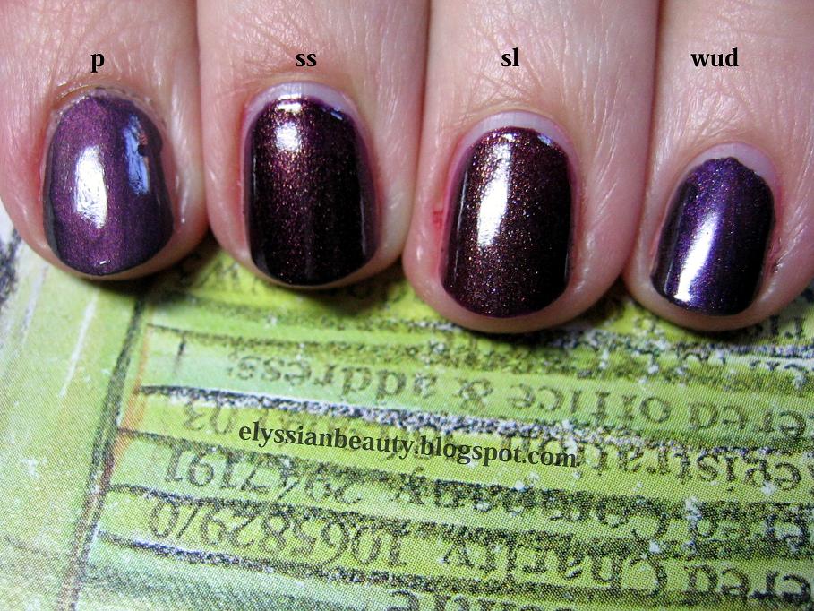
I have reviewed Ciaté's Strictly Legal in the past, but had failed to notice how similar it is to China Glaze's Side Saddle. This is why I need to make these comparisons, because I am always drawn to similar colours and textures and end up having too many dupes or near dupes which is the case with these. As always with comparisons I try to take as many pictures as possible.
Both are very pigmented and opaque in 2 coats and have exactly the same type of shimmer that shines mainly gold, but you can see reflections of pink and green as well. It's been very popular these years and it seems to be a type of shimmer you can find in a lot of nail polishes and cream eye shadows as well.
However, the base colour is slightly different. Side Saddle has a deep purple base whilst Strictly Legal is a beautiful burgundy. Both are equally dark with respect to lightness making them hard to distinguish on the nail. The one thing that is different on the nail is the way the shimmer looks. It's a lot more golden and apparent on Strictly Legal, SL looks like a polish with shimmer while in Side Saddle the shimmer is not as apparent giving it that 'lit from within' look.
All in all, they are very similar and close to being called dupes. They are not twins, they are sisters.
Bottle swatches (artificial light)
(artificial light)
(artificial light)
Side Saddle, Strictly Legal and Ciaté Wait Until Dark (artificial light)
I also thought it would be useful to compare them with another two colours, Nubar - Prevail (with a topcoat) as it is, too, a purple with hints of gold and Ciaté Wait Until Dark since it is another popular Ciaté purple, but as you can see it is not a true purple but a grey base with a lot of purple shimmer.
Bottles (natural light, shade)
Natural light (shade)
Natural light (gloomy british daylight)
Natural light (gloomy british daylight)
These last two are blurry to showcase how the shimmer looks different in the two polishes
For a very long time I have wanted a polish that has particles in but isn't shimmery or sparkly. I wanted a speckled polish. I have seen a couple this year by Misa and one by Orly and , while I am hoping there's going to be more eventually, they weren't speckled enough for me.
Tired of waiting for somebody else to bring out what I wanted, I decided it to make it myself and here it is, a pinkish nude base with lots of black speckles that neither shimmer nor shine! The colours I picked were Ciate - My Fair Lady and Guppy - 33. My Fair lady is a very sheer nude/pink french nail type of colour and guppy is and Guppy 33 is a very pigmented pinky beige. I wanted to keep the colours light because the addition of the black speckles would make it look darker. Also, the texture without a topcoat is a bit uneven (first picture) but it improves with a layer of topcoat(second picture) and is smooth with a second layer, especially if it's thick (forgot to take a picture). Here it is, my sweet Speckled!
The Maneki Neko (招き猫), the Welcoming Cat is a common Japanese sculpture, often made of ceramic, which is believed to bring good luck to the owner. Each cat has a different meaning according to colour.
I think I making an introduction to my posts the melodic way, so here's some Olga Guillot for your pleasure.
One of the presents I received these days-today actually, but I'm trying to play it cool like I didn't 'aww' when I saw them- was O.P.I.'s Dutch Treat Minis with 4 mini bottles from the Holland Spring 2012 collection. I wasn't planning on getting any to be honest, not because they don't look nice, but because they don't look too different from colours I already have. I still might get Gouda Gouda Two Shoes because I can't resist a goldish aged pink and I have nothing similar. Much as I would love to have all the hues and versions of colours I love, I've decided to be rational; if it's not different enough for a non-colour addict to tell them apart, I won't get it, i.e. no Thanks a WindMillion for me since I have these.
Nail polish is nice, all cosmetics are nice, but (a)they have an expiration date (polish, eyeliners and mascaras 'die' so soon!) and (b)they tend to look dated after a few seasons since textures and colours change dramaticaly over time. They become better and better with much fewer harmful chemicals over time which is good. Enough with the rant though, here we go!
(natural light, shade)
The colours included in the collection are:
I Have a Herring Problem
Pedal faster Suzi!
Kiss Me on My Tulips
Red Lights Ahead...Where?
(sunlight)
I Have a Herring Problem is a beautiful medium dusty blue-green colour with glass flecks in, much like the ones in Orly - Pixie Dust, only Pixie's are silver and varied in size while Herring's are blonde gold and more symmetrical. On the nail there isn't significant difference between the flecks since the yellowish tone is cancelled out a bit by the blue. The flecks are more visible in Herring because the base colour is darker, but the ones in Pixie shine more when light hits them due to the larger flacks.They are most definitely not dupes, but they are in the same family. It would be interesting to see whetherI Have a Herring Problem's sister colour in the collection, I Don't Give a Rotterdam!, is a dupe to Pixie Dust. Both are light blue greys, but I suspect Rotterdam is more blue while Pixie is more grey.
(natural light, shade)
The next ones are a bit blurry to show you how Pixie is shinier and how the difference between blonde gold glass flecks and silver glass flecks is not that big.
(sunlight)
(sunlight)
And a close of the flecks:
O.P.I. - I Have a Herring Problem
Orly - Pixie Dust
UPDATE: I had a chance to check I Don't Give a Rotterdam! myself and it's much much bluer than Pixie Dust and they have different flecks. I still prefer Pixie Dust to be honest. I like the flecks better.
Next is Pedal faster Suzi!, a blue/lavender-toned pink with glass flecks just like Herring's, only silver. I really liked it when I saw swatches of it, but I didn't like it as much when I saw it today and even less on me. The colour is just wrong for me, it make my fingers look yellow and sickly. I have nothing similar to compare it with which is probably why I forgot to take pictures of it on its own. Oh well.. NEXT!
Kiss Me on My Tulips is a pretty bright pink. I don't usually go for pinks as you might have noticed, but this one looks ok. I found a colour that I thought would look similar to is, Essie - Bachelorette Bash. It turns out they are not all that similar and when I read their colour descriptions I had a revelation. KMoMT is a bright pink whilst BB is a 'creamy, juicy fuchsia': so there is a difference between bright pink and fuchsia! I always thought they were the same colour, but as I said, bright pink is really not my thing. Maybe on a hot summer's day I'll indulge in these. That's where they belong in my mind!
Last, but not least, is the colour I though I was going to dislike and never want to wear because it's too bright; Red Lights Ahead...Where?. Actually it took me by surprise how fun and flattering it was on! Even better, it only needed 2 coats for full opacity which was a blessing as the two colours I have that were closest to it were an application nightmate. Ciaté - Mistress was too orange and Ciaté - Snatch more red and jelly-like. RLAW can stand on its own in a salmon-infused red happy universe!
A comparison between Ciaté 038 Snatch and 039 Mistress. They are extremely similar colours and without the labels it takes a while to figure out which is which. The only difference between the two is that Mistress is more of an orange red and than Snatch.
(natural light, shade)
They are beautiful colours in the bottle, but they are not very well pigmented which was a huge disappointment. I needed 4 layers of Mistress and 3 of Snatch to get them to a similar opacity level, but there is still a visible nail line. Instead of these two, I'd suggest getting Bourjois - 25 Rouge Casino. It's an exact dupe of Mistress, only it needs fewer layers. Unfortunately I've left my bottle at my parents' house, but as soon as I get it back I'll swatch and compare them.
(natural light, sunshine)
(natural light, shade)
(artificial light)
Unfortunately, even with a quick-drying top coat on you are still prone to dents and scratches if you are not careful so I summoned the concealment kitty to help hide the mess. Four layers is a bit too much for me on a busy day!!
I felt a bit inspired and was in the mood to experiment with the striper brush and my dotting tools. The result was neither quite how I imagined it nor perfectly neat, but I'm pleased since it's only a first attempt. The more I was doing, the more ideas I was getting and it ended more messy than I initially planned, but that is the nature of experimentation I suppose!
Also, I know that some people prefer to see pictures post-clean up, but I want to mark my progress in not making a total mess when applying polish so I prefer posting my pre-clean up pictures. Eventually I won't be making a mess of my cuticles and my pictures will look neater! Enough with the rant, here's the manicure
(artificial light)
The base colours I picked are all shot through with a subtle white pearl which makes the manicure come to life, but this element doesn't translate well in the pictures. What a pity! Base colours (index to pinky)
Misa - Fribbelicious
Zoya - Pasha
Nina Ultra Pro - In a Tiff
Jessica - 687 Au Natural
Stripes
CM Nail Art - 4 Brown
Dots
Ciate - 030 Gold Digga
Nina Ultra Pro - In a Tiff
Misa - Fribbelicious
...is that I always end up with the same blue-based red colour! I love it and I am always drawn to it and in fact I have another two that are exactly this colour, but they are much older so I didn't include them in the comparison. Instead I thought that a comparison between these two Essie colours would be much more useful to you my dear reader.
The first one is Essie - Fishnet Stockings. I think it's from their standard line and it's as classic as a classic red can get. I think it's most famous for being one of Dita Von Teese's favourite polishes and it's no wonder as it is gorgeous and so flattering. It's a creamy polish and very pigmented; with careful application you can even get away with only one coat and in spite of the pigmentation, it's not too much of a nightmare to remove. One of the most stricking things about this polish is that in lower light settings it looks a lot darker than any of this type of reds, so much so that I felt complelled to swatch it next to Ciaté - Dangerous Affair, but they are not as similar as I thought.
The second one is Essie - Limited Addiction. LA is Fishnet Stockings' almost jelly sister. It's the same colour as you'll see, a gorgeous bold red that demands to be called "feminine", only it has more depth due to its almost jellish nature. It was part of the Fall 2010 collection, it needs about 3 coats for a good coverage, but it does make a good mess when removed so be very careful with it.
As I mentioned earlier, I thought it would be a good idea to add swatches of them next to more reds and I picked Creative Nail Design (CND) - House of Rebels and Ciaté - Dangerous Affair. One is lighter and the other is darker. Excuse the sloppy application. I was really tired and had already swatched a lot of polishes that day. Look at my poor cuticles, so dry from the acetone.