Showing posts with label finish Creme. Show all posts

Monday, 21 September 2015

Essie – Alligator Purse for Autumn


The autumnal equinox is this Wednesday which marks the official end of the summer and the start of autumn. I know everybody gets excited about autumn, but where I live it’s a bit impossible to be excited about autumn in the middle of July in the midst of a heat wave. Today is probably the first day that feels a bit autumnal here, chilly enough for a jacket and still pretty much sunny.

Alligator Purse (613)  is one of the unsung heroes of autumn by Essie. It is now part of the permanent line  thought it first came out in 2007, before the nail blogging world exploded making certain shades iconic and our list of ‘must-haves’ longer and longer. On the website it is described as: “this luxurious creamy burnt orange polish is the perfect couture accessory and your favorite(sic) new arm candy.”

To me it looks like a brownish red which it brings to mind 70s films like ‘Last Tango in Paris’ with its heavy orange hues. It dries a couple of shades darker than it looks in the bottle and when the light hits it it looks almost brick red. It’s a perfect autumnal shade!

I shall leave you with a beautiful song by Dusty Springfield about the end of the summer. I hope we all have a great autumn!
XxX
Elysse


Sunday, 16 September 2012

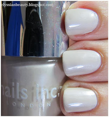
Nails Inc 4 Piece A Listers Nude Collection

I was craving this set since I saw swatches of Covent Garden Ballet a few month ago and I got it at the asos sale for £15.50. What a bargain! Getting four great polishes for little over the price of one! 
First, it's Covent Garden Ballet shot through with a delicate grey with pink-bronze shimmer. It's adorable, what more can I say! We need more delicate beauties like this. 

Next is Ledbury Road, a metallic taupe colour that looks like two of my favourite eye shadows.
In the bottle it looked a lot like my Shu Uemura ME 860 (2nd generation) ...
...while on the nail it looks more like Shu Uemura Ir 850 (2nd generation). I love them both of course so I can't help liking the polish that gives me the rather odd opportunity to match my nails to my eyeshadow. 

Lower Sloane Street is a soft caramel nude cream. It's pretty, it's easy to wear and work appropriate. A nice basic colour.
And lastly there's Mayfair, a pearlescent off-white. Even though I'm not a huge fan of white, I like this one because it's not stark. It's a little bit muted to be stark and in spite of the pearlesence, there's not issues with brush strokes. The only problem I had with this was that it's a bit goopy, not goopy enough to complain though!

Friday, 14 September 2012

Comparison: Dark Blues and Dark Greens

This is one of the oldest comparisons I haven't published since the pictures were taken back in April so excuse the dry cuticles and not very smooth application. I wanted to get Mavala - 251 Cedar Green and Mavala - 247 Mosaic Blue for some time and when I finally got them, I discovered they were exact dupes of colours I already owned, O.P.I. - Here Today...Aragon Tomorrow and Ciaté - 3 am. Girl respectively. All four polishes are great and there's really minimal differences between them.

Mavala - 251 Cedar Green and O.P.I. - Here Today...Aragon Tomorrow are very dark greens. Both require 3 coats for full opacity, though they always retain a certain jelly-ness. Both have a small amount of shimmer in that is barely noticeable in the bottle, but keeps the polish from looking too flat on the nail. The only difference I noticed was that when used for stamping, Cedar Green's pigmentation was smoother.  
Mavala - 247 Mosaic Blue and Ciaté - 3 am. Girl are midnight blues, both require 3 coats for full coverage and, like the previous couple, they have a certain jellyness to them without being true jellies. Mosaic Blue has a bit of the shimmer like the other two, whilst 3am.Girl doesn't. Again the only marked difference was when I used them for stamping where Mosaic Blue is a little bit darker. 

artificial light

with flash

stamping (natural light)


Thursday, 30 August 2012

Those Crazy Rainy Days of (English) Summer

Gosh, it's been so long since I found time to write a post, and even now it's going to be very brief! I wanted to post this mani that i made for the LDoS challenge ages ago. It's for day 11, Summer days. Well, all through the summer I don't think we've had a whole day where it didn't rain, so there you go!

Base colour: Borghese - Castello Blue, a very difficult to work with colour, but I did manage to make some 3D clouds with it because it's so thick.
Darker Clouds: konad m79 plate, Mavala - 218 Minsk with a little Olay - 680 Warm Platinum on top.

I hope you get a clear view of the full moon today!

Thursday, 2 August 2012

Dotting tool fun with Etude VIP Girl polishes

The seventh challenge in the Summer Challenge is Dotting Tool Summer Fun and fun I had. I really enjoyed making something this colourful. I don't usually use this many bright colours, but I really felt like making something cheerful today so out came my dotting tools along with the VIP Girl collection from Etude House and this is what I made!
Here is the full collection. Aren't they the cutest? From left to right they are: YL802, GR605, PK011, BL505 and PK012

XX


Tuesday, 31 July 2012

Lazy Days of Summer Challenge Day 6: Pool Party

Yeap, we're on to day 6! Pool party! My inspiration for this is the pretty iridescent tiles you see in pools some times. The base colour is Mavala 167 Cyclades blue, one of my favourite summer blues, the tiles are China Glaze - Rodeo Fanatic and Oil of Olay  - Lagoon. I went around a few of them with white acriilyc paint and used Seche Vite on top. 


Sunday, 22 July 2012

Mavala 167 Cyclades blue and Nautical Flags

For my 'flag day' theme of the Lazy days of Summer challenge I decided to not do the obvious thing and go for a national flag, but instead go nautical. The first time I found out about this peculiar nautical language was when I was little and watching MacGyver on tv. It's a pretty colourful way to communicate, isn't it? You can find all of the flags here

This is actually my second attempt to do this challenge. The first one was so much of a fail I had to re-do it. I decided to do it with acrylics using my left had, just to get a bit of practice. The base colour is Mavala 167 Cyclades Blue. It doesn't get more summery than the blue colour of the Cyclades islands! I hope you like it!

Wednesday, 18 July 2012

My Summer Ombre: Red to Yellow

This is my 2nd day entry for the Lazy Days of Summer challenge, my summer ombre. Summer should ideally be hot so I chose hot, fiery colours for my ombre.

I did cheat a little bit though as I used three nail polishes instead of two. The red(thumb) is Creative Nail Design #431 House of Rebels, the orange (middle) is a custom mix I created last year when orange polishes were not as popular and the yellow is from Etude House.>

The pictures came out a bit funky coloured and I have no idea why. I tried to correct the colours a little bit, but I kind of like it. It looks a bit retro!

Friday, 1 June 2012

Drk-A, Westside Warrior and Crop Circles

I've had China Glaze - Westside Warrior for the longest of times and hadn't worn it for some reason so I decided it was about time. It's actually a very nice polish, maybe a little too yellow-leaning for me to love it (I have Foubert's place for that), but the texture is nice and it applies smoothly in two coats.

I also decided to go one step beyond and do the 'dreaded' accent nail for which I used  Bourjois 39 Jaune Trendy and Westside Warrior as a stamping polish using a design from my beloved Drk-A palette. WW is actually fantastic for stamping as it is very pigmented. I really liked the end result, it looks like a field with crop circles!
Artificial light

Tuesday, 29 May 2012

Barry M Blue Moon and Some Daisies


I finally got the Drikk Drk-A plate! Yay!! I had wanted that plate since I first saw it because I find the desings much more to my liking than other sets. I will review the plate in dew time, when Drk-B gets here,too. For those of you who are interested in them, it used to be that you had to fill in a google doc to get it straight from the makers in Brazil, but the people at Ninja Polish have made both the Drk-A and the Drk-B plates easily accessible from their website. I ordered from overseas and it only took 6 working days to get here!

I started with a happy little design since it's been so hot these days. It's the first true spring/summer pastel I've worn in a long time, but the cuteness of the design helped the transition. 
The base colour is Barry M - Blue Moon (np317). I can't say I liked it very much as a texture I'm afraid. It proved a little difficult to work with, but I guess that's what happens with most pastels. In the bottle it has a blue sheen, but that's not apparent on the nail at any point. 
Then I used the beautiful Mavala - Cyclades Blue (167) to get the daisies on and with a dotting tool I added yellow dots here and there.

I hope you're enjoying the good weather!

Friday, 18 May 2012

A bit of sunshine: Bourjois 39 Jaune Trendy

Ανάρτηση στα ελληνικά
I am so tired of this November weather. I really needed something sunny and playful and since I can't make a quick escape to somewhere warmer and sunnier, I settled for a sunny colour on my nails with a bit of stamping to make it more interesting.

The base colour is Bourjois 39 Jaune Trendy, a lovely warm mustardy yellow that is rather goopy and I think I should add a few drops of thinner before I use it next time.

Then I put nail guides on to limit the design on the top third of the nail only and stamped it with Konad White stamping polish using Bundle Monster plate BM21. I finished it of with dots of greens and blues. From thumb to pinky they are: OPI - Jade is the New Black, China Glaze - For Audrey, China Glaze - Flyin'High, W7- Stellar, China Glaze - Aqua Baby.
Natural light (overcast)

Monday, 7 May 2012

'Sad Eyes' Duelist Mani: Black on Black

How do I begin this post without getting distracted by Kang Dong Won and the Duelist's beautiful soundtrack for another hour? By sharing a song with you my dear reader!
'The Duelist' is a fictional period Korean film with stunning visuals, a beautiful, sad love story and two of my favourite Korean actors, Kang Dong Won and Ha Ji Won. If you like "Crouching Tiger, Hidden Dragon" and "House of the Flying Daggers", then definitely watch this; the budget may not be as enormous as it was for those two films, but it is truly wonderfully shot, the script is good and the actors great.
When I first started nail stamping last year, one of the patterns I wanted to recreate was from the protagonist's costume. Sad Eyes wore mostly black textured clothes and this idea of black on black simply stuck with me as I am fascinated by black. I tried many times to create something similar back then, but the results were not good enough.
He's so gorgeous!
Beautiful fabrics and a beautiful man. Ah! My heart! 
Enough with the Kang Dong Won spam, back on topic. A few days ago Nathalie (jellynat) had this post up which reminded me of my quest for the black on black mani I wanted to do. Then this scandalously pretty picture of JaeJoong appeared yesterday from the upcoming 'Time Slip Dr.Jin' Korean drama who reminded me of 'Sad Eyes'.
He is a real person, not a CG character.
The final blow was delivered by my friend Orion who reminded me of all the above, so I did it. This time I picked a pattern that would allow for the different textures to be more apparent, as my previous choice (the multiple squares from the konad m63 plate) was too dense and it ended up looking muddled instead of textured. My only complaint this time is that I should have used a thicker black glossy polish to stamp. The one I usually stamp with was ruined when I decided to 'experiment' with it a few weeks ago. The search for the perfect black on black mani continues, though I think that first I'll have to do a red on black like JaeJoong's costume.
basecoat: SpaRitual - Body
Stamping polish: Bourjois - 39 Noir de Chine
stamping plate: Konad m64

PS- Should I have a 'gorgeous Korean men with swords' tag now? haha...

Thursday, 3 May 2012

Korres Nail Colour in 92 Vert Amande and Yamapi

Αυτή η ανάρτηση στα ελληνικά 
Today I received the most amazing packet from my wonderful friends full of presents that made my heart flutter like a five-year old's on Christmas day. It took me about an hour and a half to go through them all. Am I the only one that prefers a million little things instead of a big present?! The Yamashita Tomohisa fan in the picture below was in today's parcel and deserves a spot here. Yamapi(山下智久)is a Japanese pop star/actor and, thought I am not a crazy/omgodIhavetowatcheverydramaheisin fan I find his diary entries very amusing as it's like reading a kid's diary; they are almost always about him being hungry, what he ate, how he worked out and -of course- the weather report. He makes me laugh. My friends know me so well that some of the things they sent me are cosmetics and they will be featured here! 
My mani with a Yamapi fan that was also in the packet.
My friends are crazy and funny.
The first of these things is a Korres nail polish! I didn't even know that Korres had a nail polish line till a friend told me about them and then she sent me this one, isn't she great? I've not found them in their on-line shop so I'm not sure where you'd get them from at the minute. Korres polishes go beyond 3-free; they are 7-free as they have no silicones, acetone, phthalate, formaldehyde, camphor, toluene and xylene. Now if only they were a certified cruelty-free company, too, that would make them fantastic! I don't know why they haven't made a move towards that, but it's a shame as they are great in all other respects.
The colour I received is Vert Amande (92), a beautiful minty green cream. I've not checked out all the colours, but I am sure that this would be the first colour I would want to try. Even though it's a cream it has depth; it feels a bit like a jelly, but still manages to be opaque in two coats. I really love it! It's also not too pastel or stark and it doesn't give me lobster hands. The application was very smooth as you can see from the pictures. The brush is a normal round brush, not flat like I am used to and it'd be nice to see this improve in future versions. Normally I make a good mess of my cuticles when I am handling a round brush, but look at the pictures: no mess even though I've not done a clean-up! It applies like a dream, smooth and perfect with no issues of bubbling. I don't know how long it would take for it to dry as I applied a fast-dry top coat.
One coat (artificial light) Check out how smooth it goes on!
Two coats (natural light-cloudy)
Of course, I had to do a bit of stamping. I used SpaRitual's gorgeous dark bronze colour Running with wolves and Bundle Monster plate BM214 (from the second collection of plates). 
Thank you my dear friends! You bring so much light in my life!

PS- Excuse the slightly blurry pictures. My camera broke down, I have a new one and I'm still getting the hang of it.  

Wednesday, 25 April 2012

My First (and Only) Crackle Polish: P2 - Violet Fusion

I never really "got" crackle polish and I don't like glitter polish; put the two together and suddenly I am a fan. Even I don't get myself sometimes, but that's one of the joys of being human I am guessing!

Lo and behold the polish! P2 - Violet Fusion over SpaRitual - Solitude. Violet Fusion is a jelly purple base with gold fine glitter in, but not the kind of glitter that takes forever and a day to remove. Pretty!
When this came out there weren't any other sparkly crackle polishes on the market, but there's plenty now. OPI has a couple and China Glaze has the Crackle Glitters. 

I wore it for 5 full days which means love. 

Friday, 20 April 2012

Nails Inc - Duke of Wellington Place a.k.a.I created a swamp (monster)

I went a bit abstract this time. I've been too stressed to sit down and think of a design, I just wanted to make something. It looks a bit like a swamp at dusk, but it's fine! I started with a dark blue-ish grey (nails inc - Duke of Wellington Place), then dotted it with a golden olive (China Glaze - Peace on Earth) and then added details with a blue/teal/lavender multichrome polish (Leighton Denny - Your Planet or Mine). It's a shame the sun wasn't out and I couldn't show the other colour shifts in Your Planet or Mine. It really brought the whole thing together and made it interesting. I'm glad I thought of adding it because I was one step away from calling this mani a failed experiment and removing it.

Natural light (cloudy gloomy weather)

Artificial light
I'm also thinking of making a lightbox. I'm tired of this glare in my pictures! It's annoying.

Saturday, 31 March 2012

Nubar Toasted Marshmallow with a 70s Twist

As I said before, Nubar - Toasted Marshmallow has become a favourite not so much because it's a great colour on its own, but because I have been looking for this colour for designs I want to do. Here is the first one in a style that is full of late 70s nostalgia, a time where this sort of yellow along with brown and warm red was very fashionable - or at least that is the impression we are left with. Of course I added a Carpenters song to match the mood!


The breakdown
Base colour: Nubar - Toasted Marshmallow (2 coats)
Stamping polish: Le Chat Cm - 04 Brown Nail Art Polish
Plate: Konad m65
No topcoat.

I decided not to use a topcoat with this but instead take advantage of the matte finish that this brown polish has and add some texture to the mani even if it meant it wouldn't be as long lasting.

Wednesday, 28 March 2012

China Glaze VIII: Aubergine Dream

I don't know why I hadn't posted this earlier, I took the pictures ages ago. China Glaze VIII. is an older polish that came out on a special anniversary series China Glaze did some time ago. It is beautiful, it goes on smooth as a butter, doesn't chip for ages and the colour is a gorgeous true aubergine (eggplant for those across the pond). See for yourselves. Here's a couple of delicious Greek aubergines 
And her is the polish (2 coats, no topcoat)


Friday, 23 March 2012

Nubar Spring 2012: Toasted Marshmallow

In the Nubar Spring 2012 Jellybeans collection Toasted Marshmallow (NJB263) was considered by some the least wanted colour. Well, I'm most definitely not one of them; when I saw it, it was a 'halleluja' moment! I have been looking for a colour like this for so long that I had to get it as soon as possible. It's been with me for the last month and I've been using it for so many manicures that you will grow tired of seeing! Haha! Before I start the madness though, here is the colour itself.

I would describe it as a muted goldenrod yellow, like you mixed a bit of brown to dampen the goldenrod a little bit. It is not the most amazing colour on its own, especially not on fingers like mine where I have a lot of red pigment on my fingtips, but it doesn't make them look bad. It's not giving me lobster hands like a green would, a problem I've had with similar colours that have green in them. It's a subtle, easy to wear 'confiture de lait' colour.


Related Posts Plugin for WordPress, Blogger...