It had been quite some time since I had
done nail art of any sort, but the other day I met up with some friends, had a
totally girlie day of pampering and playing with beauty products. By the time I
got back I felt really inspired to do something playful and here it is, a
stamping design that owes a lot to Sanrio’s Little Twin Stars.
My nails are shorter than usual at the
moment which meant I could use a design from the Bundle Monster BM20 plate. The
pastel yellow base is Korres’ 34 – Pastel Lemon and for stamping I used various
mixes of:
Speaking of stars, tomorrow and the day after (11&12/08) the Perseids
Meteor Shower will be at its peak. Do you plan on staying up and watching the
falling stars? Here’s a link to read more about it if you like.
Another one from the vault, one inspired by the many fantastic visuals of the Big Bang "Fantastic Baby" video. I wasn't that keen on the music when I first saw it as kpop is not really my thing, but the style was out of this world.
Let's see if I can remember all the colours I used for this.
Index
A-England - King Arthur (base), Camelot (black) and Stargazer - 232 (silver) stamping with at least one Βundle monster plate.
Middle
The dark base is Galahad by A-England, the thin shiny stripe is Le chat CM - Ashy Green, the tiny triangle is by a greek brand called Erre Due and I suspect the thick stripe is For Audrey by China Glaze.
I am not even going to attempt the ring finger though I recognise a couple
Little finger (not Petyr Baelish)
Etude House (white), A-England - Camelot and Seventeen 533.
The video follows, but if you're not used to kpop , listen at your own peril!
That's it from me and T.O.P.
I have kind of disappeared from this blog, and somehow I always make it back for Hallowe’en. I am starting to believe I may be the phantom of the blogosphere! MWA HA HA HA…
I was only planning on doing some basic Halloween themed stamping, ideas started forming in my head, one thing led to another and I ended up painting them all by hand. It was good fun! They weren’t supposed to be this side up which is how I ended up with the anti-gravity blood. I was going to fix it, but I like it like that. It's more ghoulish!
The nail polishes I used are (thumb to pinky):
Etude House – WH702 with brushstrokes of Korres – 32 Light Mocha
OPI – Stranger Tides, the perfect ghoulish colour
Etude House – WH702 with drops of Essie – 381 Fishnet Stockings as blood
A-England – Camelot, the perfect black for the darkest of nights
Korres – 51 Tempting Coral.
The details were done using acrylic paints.
I couldn’t leave without an appropriate song so here is Tom Waits. It’s the song I was listening to while the idea for the meeting of preternatural creatures on my nails came.
XxX
Elysse
The seventh challenge in the Summer Challenge is Dotting Tool Summer Fun and fun I had. I really enjoyed making something this colourful. I don't usually use this many bright colours, but I really felt like making something cheerful today so out came my dotting tools along with the VIP Girl collection from Etude House and this is what I made!
Here is the full collection. Aren't they the cutest? From left to right they are: YL802, GR605, PK011, BL505 and PK012.
My fourth entry for the 'Lazy Days of Summer"challenge, the flip flops. This was a real challenge as I really don't like flip flops. I went for something more traditional than flip flop and west for a geta-like design. The base colour is Etude House Matte 1 - Black tea.
This is my 2nd day entry for the Lazy Days of Summer challenge, my summer ombre. Summer should ideally be hot so I chose hot, fiery colours for my ombre.
I did cheat a little bit though as I used three nail polishes instead of two. The red(thumb) is Creative Nail Design #431 House of Rebels, the orange (middle) is a custom mix I created last year when orange polishes were not as popular and the yellow is from Etude House.>
The pictures came out a bit funky coloured and I have no idea why. I tried to correct the colours a little bit, but I kind of like it. It looks a bit retro!
I finally got the Drikk Drk-A plate! Yay!! I had wanted that plate since I first saw it because I find the desings much more to my liking than other sets. I will review the plate in dew time, when Drk-B gets here,too. For those of you who are interested in them, it used to be that you had to fill in a google doc to get it straight from the makers in Brazil, but the people at Ninja Polish have made both the Drk-A and the Drk-B plates easily accessible from their website. I ordered from overseas and it only took 6 working days to get here!
I started with a happy little design since it's been so hot these days. It's the first true spring/summer pastel I've worn in a long time, but the cuteness of the design helped the transition.
The base colour is Barry M - Blue Moon (np317). I can't say I liked it very much as a texture I'm afraid. It proved a little difficult to work with, but I guess that's what happens with most pastels. In the bottle it has a blue sheen, but that's not apparent on the nail at any point.
Then I used the beautiful Mavala - Cyclades Blue (167) to get the daisies on and with a dotting tool I added yellow dots here and there.
Tonight dear readers put on your rose-tinted glasses as we will be travelling to late 19th-early 20th century Austria. Let's start with some appropriate music: Mahler's 5th Symphony conducted by von Karajan; could I have more Austrians in one post? Of course!
Gustav Klimt was a very unique artist, as well as a controversial personality. He had his artistic vision and wasn't afraid to pursue it, even if it meant making (a lot of) enemies on the way and fathering plenty of children. His most famous paintings have been and still are very popular, though they are not referenced as 'pornographic' any more (woohoo! Civilization is moving forwards despite honest efforts to not do so!). Klimt's paintings are so full of colours, textures, patterns that you could spend hours looking at each one and still not manage to see everything in it. They feel alive when you look at them, they feel like art should feel: mesmerizing. It isn't any wonder at all that his portrait of Adele Bloch-Bauer is the most expensive painting ever sold openly.
The Kiss
For this manicure idea I wanted to bring out another side of him that is not as well known as his popular paintings; his postcards. He used to write many postcards -there's over 400 if I'm not mistaken- to his life companion Emilie Flöge which he would decorate himself. Many years ago I saw one of those cards in a book about him, the image stayed with me and I was lucky enough to find a digital copy of it. I have a sincere love for the heart symbol so I'm guessing I don't need to explain exactly why I like this card. For my third attempt with brushes and acrylics, I had a go at this:
I did get a better brush this time, but I need to find an even thinner one. I know I should practice these more elaborate designs, but I really can't bring myself to do it. I am so busy with everyday life I just want to relax when I do these and -heck!- you only live once.
Artificial light
Artificial light
Natural light (cloudy weather)
What I definitely need to practice more is taking better pictures with my new camera. I didn't manage to take great pictures this time either and I can't pinpoint the problem in the settings I use. It's also adding a yellow tinge to my hands which is so not flattering, especially on top of my inability to capture the perfect hand-pose these days. I will get there, I'm stubborn. And I have probably scared you off with my rant. Hahaha! I hope you like the mani anyway!
Tschüß ♡
Of all the beautiful polishes that I own Etude House PP904 Mystic Purple, this is in a league of its own. It's just so unique! It's not a duochrome, but it looks very different depending on the light. It can look from purplish-grey, to purple, purple with bronze sheen and when the light hit it directly it simply glows. The base colour is a cool purplish grey with a lot of pink and gold micro shimmer which combine to give it the bronzy hue, but at the same time you can see both the gold and the pink sheen. Honestly, I just wish I could capture it with my camera, but I doubt any camera can capture its many 'faces'! It only takes 2 coats to make it opaque, it's smooth and it has s small, flat, excellent brush!
The Maneki Neko (招き猫), the Welcoming Cat is a common Japanese sculpture, often made of ceramic, which is believed to bring good luck to the owner. Each cat has a different meaning according to colour.
My first attempt at French style stamping. I didn't quite succeed in stamping properly, but somehow I managed to stamp the gold over the green almost perfectly. Learning curve, learning curve..
Base Colour Etude House - GR605 V.V.I.P. (one coat)
Etude House is a Korean brand and they make a lot of pretty polishes some of which I own. This is the brand's pretty greige (for the unversed amongst you greige = colour midway between grey and beige), otherwise known as Etude House - WH708 creamy grey. I don't have any other greiges to compare it to as I was pretty happy with this one's colour. I have used it again here if you want to see more of it. It was a bit thick when I got it so I added a few drops of nail polish restore and now it's much better. The brush on these polishes was a pleasant surprise as it is flat and easy to work with and doesn't splay. This is two coats without a top coat.
(artificial light)
(artificial light)
(artificial light)
I bought this and many others from this ebay seller and have always received excellent service and many Korean gifts!
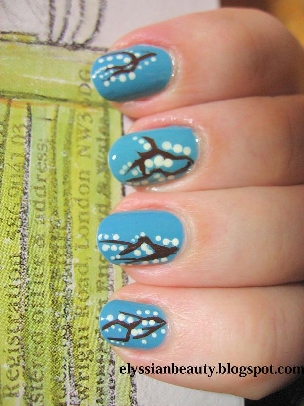
It's been frosty yet sunny these days and the bare tree branches look so nice with frost on them. If only the pavements weren't so slippery and dangerous! I hate having to walk around when there's sleet. I'm not used to it at all and as a result I walk around like an old duck, looking at everyone else who, being more northern than I am, walk normally. How do they do it? Is it a superhuman skill? Ugh...
Btw have you noticed the Google Doodle today? It's for Charles Dickens'200th birthday! Yay! I hope people turn to reading more of his books this year. I was reading earlier in a British newspaper that kids these days lack the attention span for reading his books and if that isn't a sad thing, I don't know what is.
Anyway, I shouldn's stray off on other topics too much or at least that is the purpose of this blog. Back to the mani! It's a blue skies&branches&snow theme! I used China Glaze - Flyin'High as a base, Le Chat Cm 04 Brown Nail Art Polish for the branches, Etude House - WH702 for the snow and Seche Vite Top Coat.
I've missed the decorative motifs in the old buildings at home in Athens (Greece) and I wanted to create something quite earthy, ceramic looking, like a decorated tile.I really wanted this to be matte because I prefer the natural matte surface of ceramics to the polished one; they feel more primitive in a nice way. By touching their rough surface you realize that you're touching a piece of moulded soil and it is as beautiful as it is simple.
Base colour: Etude House - WH708 (greige)
Stamping colour: Olay - Terra
And of course Manglaze - Matte-astrophe to complete the look.
Since I have a few colours that seem to belong roughly in the same dirty turquoisy/greeny group I thought people might find a comparison useful. The polishes I compared are:
It's geeky time! Following a discussion I had earlier with some friends I was reminded of one of my favourite characters from an animation horror series, Mononoke(モノノ怪)'s Kusuri Uri (薬売り), the Medicine Seller. He is a sort of mysterious psychic detective and amongst other things that add up to make this character amazing, he also sports purple nails and I haven't done purple nails in quite a while so ...
I didn't want to do plain purple though so I did an accent nail where I tried to paint freehand a pattern from his kimono. Here it is:
The breakdown
OPI - Parlez-vous OPI?
The greenish background is a custom mix of equal parts of Misa - Dirty, Sexy, Money and OPI - Mermaid's tears.
H&M - Moody model (the teal)
Etude House - yellow
The red was a custom mix of Ciate - 138 Snatch and a bit of white. Green cancels red sο it really needed something to make it stand out and a little bit of white was just it. I also picked an orange-based red becuase I didn't want the addition of white to make it look pinkish.
Too bad the top coat dragged the design a bit! I hope you like it!
Before I made this blog, I used to take pictures of my nails and make up to show to my friends whenever I did something out of the ordinary or when a friend wanted me to swatch and compare some things I have. Scheming through some old pictures I found these pictures taken right before I went to Greece for my holidays. I never wear white polish as I find it too stark, but with a blue stamp covering most of it I loved it! The inspiration for this combination was taken from the designs of the metallic bars in balconies in Greece. I find them so fascinating. Almost no two are the same.
I miss the summer!
I used Etude House as a base and China Glaze - First Mate for stamping.
The gloom of winter is fast approaching and I wanted to wear a rust/terracotta kind of colour. H&M's Looks Great on You was perfect for what I wanted!
Two days later I got a bit tired of it and decided to use a stamp design that is the complete opposite of the current weather: flowers (Konad plate 51).