Showing posts with label colour Orange. Show all posts

Saturday, 28 November 2015

Korres Nail Colour Mega review - part1 (picture heavy)

I had reviewed a nail polish by Korres in the past, but since then my collection has grown a lot which is a testament to how fond I am of them. After I finish presenting all 21 of them I will finally announce my first giveaway.Yay


Some general points about these polishes:
  • They are perfect for those looking for more muted tones. Their more winter colours have a characteristic and unmistakable muted quality to them which makes even the more unusual colours look very chic and wearable.
  • They are 7- free, i.e. they contain no silicone, acetone, phthalate, formaldehyde, camphor, tuolene and xylene. Their smell is really inoffensive, there’s hardly any of it. They also contain myrrh extract, provitamin B5, and oligoelements.
  • Each bottle contains 11ml and the brush is medium sized and flat, not as bit as an O.P.I. brush, more like an Etude House one.
  • Their formula feels different to other polishes, they are easy to control, apply very smooth and level very well. They don’t tend to pool at the sides at all even when I applied a thick layer (see the yellow below).
  • They are easy to remove and do not stain the nail.
  • All pictures were taken without a top coat.

All of them were bought with my own money. You can find more of them at the company website (non-affiliated link).

47 – Apricot: in the bottle in looked more pastel, but it a dries a little darker, to very cute apricot colour. It’s a cream that levels nicely when applied and requires 3 thin layers for full opacity.
13 – Sweet Pink: a salmon pink with the familiar silver sheen. It feels very romantic and autumnal. Opaque in two layers.
34 – Pastel Lemon: as with most yellows, this is applies a bit patchy. It’s the only one of the lot that I had any problems with though it was fine with 3 layers. It also has a sheen put it’s completely undetectable.
The golden sheen is apparent in the bottle, on the nail it's a different story.
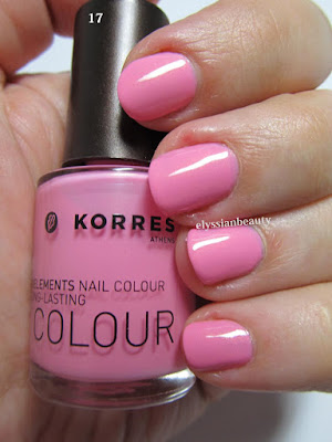
17 – Candy Pink: the most appropriate name for this vibrant blue toned pink. It has a slight golden sheen that is very typical of Korres’nail polish, but in this case it is not really visible on the nail. It needs three thin layers to reach full opacity.
22 – Flashy Fuchsia: again, a very correctly named colour. It, too, has the golden sheen only in this case it is more visible, but not distracting from the colour. It’s in the same family of colours as Essie’s Rose Bowl, only this is a deeper vibrant colour. Opaque in two layers.
51 – Tempting Coral: this is a jelly-like (a crelly maybe?) polish with the same golden sheen. The sheen is not visible as a golden colour, it just makes the polish more vibrant. A very summery colour, deeper and more orange than both Ciaté Mistress and Snatch and with the same type of opacity. Even with 3 layers on I can detect a VNL, but I still like it for its juicy look.


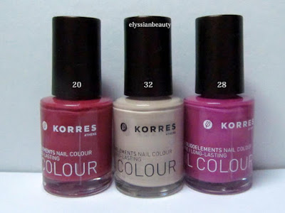
20 – Pink Azalea: a muted berry pink. Perfect in 2 coats and super smooth to apply. There’s also a deeper and redder version of this that I saw in the shop the other day and I know I need to get that, too.
28 – Disco Purple: Another colour that makes you think of the late 70s disco craze. I can’t help but think that this is a nod to the classic YSL Fuchsia. It’s a medium pinky orchid with a pink flash. Opaque in 2 coats.
32 – Light Mocca: this one has a silver sheen, too, but it’s almost undetectable even in the polish. It’s just there so that this beige colour won’t look flat. Three layers for full opacity.
33 - Metallic Sand: a light/medium sand colour. It has a light silver sheen to it that is visible when the light hits it. A good work-safe colour. Opaque in 3 layers.
65 – Metallic Bronze: a medium and rather cool bronze colour. It applied a bit streaky, like metallics do some times. It is such a pigmented colour that you could get away with single coat, though I obviously did two for the swatch.
61 – Metallic Taupe: a silver-brown taupe. 61 is not as streaky as in looks in the picture and it looks more brown under natural light. Opaque in 2 layers. 

I love both 61&65 cause they have a very vintage feel to them with 61 being the late 70s Bianca Jagger in studio 54 kind of colour and 65 being early 80s Crystal Carrington from Dynasty type of colour, equally unique in my collection as colours and textures. 

That's it for today. Tomorrow it's going to be all about the cool colours!
XxX
Elysse

Thursday, 13 September 2012

Greek Stories I: Seventeen - 533

As I mentioned previously, I am currently in Greece. I hadn't been in a beauty supply store in Greece in ages and when I did, I was taken aback by the amount of nail polish and brands available. I try to hold myself back and not buy everything I like and I regret not having taken my polish sample wheels with me to make sure I don't get any exact dupes as too often I find myself gravitating towards the same colours and the even the same hues.

Here is the first one I want to show you by a brand called Seventeen - no relation to the UK brand 17. As soon as I saw this deep glowing orange (at the lowest shelf no less!) I knew I had to have it. It's only the second orange polish I own, but it has become a firm favourite. It's so warm and beautiful it almost soothes me when I look at it. 

I know there is a similar orange by OPI in their Germany collection called Deutsch You Want Me Baby?, but I don't think they are dupes. I haven't had a chance to compare them side by side, but from what I've seen 533 is more vibrant and less red than DYWMB. It also stamps well as it is very pigmented, a very well behaved polish that took two coats for complete coverage with no brush stroke issues at all. What I did notice with Seventeen polishes in general is that they take a while to dry, but with a quick drying top coat it's all good. All in all, I love this autumnal beauty very much.

Let me know what you think of my pretty find!
X

Tuesday, 11 September 2012

Tangerine, flowers, fun and a personal challenge!

It's been such a crazy time! A million things happened at once which is why I've been absent for so long. I am currently not in the UK, but in Greece visiting my family and checking out all the amazing new cosmetic products that have become available since I was here last. I know we are in the middle of a recession, but the Greek cosmetic companies seem to be blooming and I am so glad. You will be reading more on this as I review the products, before that though there's some things I need to get done.

Over the course of this year I've left so many manicures, comparisons and reviews unpublished. Additionally, my skills in doing my nails have developed quite a bit since I first started and anything I don't publish within a a month looks so bad to me after a while that I don't want to publish it. I've set myself a challenge: to publish all the neglected drafts I have by the time this blog turns 1 in a few days. It's a difficult challenge given that I blog in two languages (twice the fun!) and have very little time to do it at the minute, but difficulties make a challenge more interesting. Here it goes then!

Tangerine is such a fun colour! I'm glad it was this summer's colour. It's one of the very few shades of orange I like on me. This is a manicure I did a while ago using the polish I had mixed as a base, Miss Sporty - 455 for stamping and plates Dkr-b (floral deign) & Bundle Monster bm 201(stripes).

Wednesday, 18 July 2012

My Summer Ombre: Red to Yellow

This is my 2nd day entry for the Lazy Days of Summer challenge, my summer ombre. Summer should ideally be hot so I chose hot, fiery colours for my ombre.

I did cheat a little bit though as I used three nail polishes instead of two. The red(thumb) is Creative Nail Design #431 House of Rebels, the orange (middle) is a custom mix I created last year when orange polishes were not as popular and the yellow is from Etude House.>

The pictures came out a bit funky coloured and I have no idea why. I tried to correct the colours a little bit, but I kind of like it. It looks a bit retro!

Monday, 25 June 2012

Tangerine Summer with RMK

By now I think we've all gotten enough of the Pantone colour for this summer, Tangerine Tango, in all sorts of products and -most prominently- lip colours. I can't say I've taken part in the tangerine madness and it's all due to these two products which I've been using non-stop for the past two summers and will be using for this one, too.

RMK Gloss Lips N CL-02 Clear Orange is the only lipgloss that's ever won my heart. I am a lipstick girl through and through and, yes, I did manage to spent all of the 00s without becoming enamoured to lipgloss; CL-02 is just this special and different. It's not sticky and it's not icky in the way a gloss can be and it has no sparkles. It's a beautiful clear orange; I liked the clearness of it so much I used to get obsessed about not tranfering any lipstick in the tube with my brush. I apply it sheerly and it enhances my natural lip colour and makes them look juicy. I start using it when the days are growing warmer, and it's one of only two lip products I took on my holidays last year when I decided I wouldn't take too much make up with me. It's summer in a bottle for me! The applicator is a plastic brush which started splaying after I'd used about half of it, but it was nothing I couldn't fix with a pair of scissors. The good news is that CL-02 is part of the permanent line. Permanent lines are so often ignored in favour of seasonal lines, but look at the gems one can find! I'm already on my second tube and will be getting more after this. 

RMK Sweet Colour Lip 01 Tangerine was part of a seasonal line from 2007 or 2008 and it is a coloured lip balm, pretty much in the same vain as the Clinique Honeys and all the other sheer lipsticks that have become so fashionable. I love lip products like that cause they give a bit of colour, but you can still see the natural colour and texture of your lips. I'm not going to say much more about it since it's a long discontinued product, but I like it so much that I couldn't leave it out. It was -in my opinion- the best one of that line and I use it all through the winter. I was lucky enough to find one on ebay earlier this year as I had finished my first tube ages ago and after this one is gone, I'm going to miss it!

RMK products are a little difficult to find, but you can check out their website in case there is one near you or you can order via telephone.


Sunday, 22 January 2012

Comparison: Ciaté Bright Reds

A comparison between Ciaté 038 Snatch and 039 Mistress. They are extremely similar colours and without the labels it takes a while to figure out which is which. The only difference between the two is that Mistress is more of an orange red and than Snatch.
(natural light, shade)
They are beautiful colours in the bottle, but they are not very well pigmented which was a huge disappointment. I needed 4 layers of Mistress and 3 of Snatch to get them to a similar opacity level, but there is still a visible nail line. Instead of these two, I'd suggest getting Bourjois - 25 Rouge Casino. It's an exact dupe of Mistress, only it needs fewer layers. Unfortunately I've left my bottle at my parents' house, but as soon as I get it back I'll swatch and compare them. 
(natural light, sunshine)
(natural light, shade)
(artificial light)

Unfortunately, even with a quick-drying top coat on you are still prone to dents and scratches if you are not careful so I summoned the concealment kitty to help hide the mess. Four layers is a bit too much for me on a busy day!!

Thursday, 12 January 2012

Experimenting with Dots and Stripes

I felt a bit inspired and was in the mood to experiment with the striper brush and my dotting tools. The result was neither quite how I imagined it nor perfectly neat, but I'm pleased since it's only a first attempt. The more I was doing, the more ideas I was getting and it ended more messy than I initially planned, but that is the nature of experimentation I suppose!

Also, I know that some people prefer to see pictures post-clean up, but I want to mark my progress in not making a total mess when applying polish so I prefer posting my pre-clean up pictures. Eventually I won't be making a mess of my cuticles and my pictures will look neater! Enough with the rant, here's the manicure 
(artificial light)
The base colours I picked are all shot through with a subtle white pearl which makes the manicure come to life, but this element doesn't translate well in the pictures. What a pity!
Base colours (index to pinky)
Misa - Fribbelicious
Zoya - Pasha
Nina Ultra Pro - In a Tiff
Jessica - 687 Au Natural

Stripes
CM Nail Art - 4 Brown

Dots
Ciate - 030 Gold Digga
Nina Ultra Pro - In a Tiff
Misa - Fribbelicious

Saturday, 29 October 2011

This is Halloween


Halloween is on Monday and it's fnally time to use the Halloween-themed designs on the Bundle Monster plates. I also decided to attempt a gradient nail using a sponge. I think it's ok for a first try!

The colour I used as a base was a jelly orange I made (or frankened as people tend to call these polishes) last year that I was craving for a jelly orange to match my favourite lip-gloss. It also saved me from buying O.P.I.'s Texas collection's jellies that came out a little bit later.
For sponging I used
1 layer of Oil of Olay - 680 Shimmering Sable (dark brown base with a bronze shimmer)
2 layers of Nubar  - Dark Castle (darkest grey with a metallic sheen) and 
1 layer of Seche Vite Dry Fast Top Coat

This is a picture I took with only the brown polish sponged on. 

After everything was nice and dry I used StarGazer Chrome 232 (silver) for stamping.


A few days earlier I had attempted to do another similar mani over ManGlaze's Matte is Murder, but the StarGazer Chrome 237 (gold) wasn't bright enough over black. Oh well.. It's still fantastic over other colours!

Happy Halloween!


Wednesday, 26 October 2011

Autumnal Irony: H&M - Looks Great on You

The gloom of winter is fast approaching and I wanted to wear a rust/terracotta kind of colour. H&M's Looks Great on You was perfect for what I wanted!

Two days later I got a bit tired of it and decided to use a stamp design that is the complete opposite of the current weather: flowers (Konad plate 51). 

Related Posts Plugin for WordPress, Blogger...