Showing posts with label brand Korres. Show all posts

Thursday, 22 September 2016

How I did my nails in high school

I saw this “How I did my make up in school” challenge that’s been making the rounds on youtube and really wanted to do a similar thing for nails, though I’m going to stretch the time-frame a bit. I even tried to do it using the same tools and methods I used back in the day (late 90s-early 00s) and it proved to be so much fun. I can tell it’s going to be a chattier entry than usual so I hope you enjoy this trip down memory lane with me.

First of all I was a really late bloomer with regards to make up and polish. In fact I used to hate both and if you knew me then, you wouldn't believe my love for them now. Though I always had long nails, usually square or squoval as that was the fashion back then, I never wore any polish and avoided beauty shops like the plague. Pearly polishes, pinks and corals were just not my thing and vampy colours were too scary for young me. 

That all changed in my last year of high school when iridescent polish became very popular. Anything iridescent catches my eye and the allure of iridescent nails was too strong. I went to a beauty store to find iridescent polish and *boom* that was it. I fell in love with all the new unusual colours that were out back then and while I started with what we’d now call an iridescent top coat I soon moved on to the sparkly dark blues, the purples, the blacks and glitters. I think I ended up having more than 25 polishes at a time when it was unusual to have more than 5. It was true love and I wish I hadn’t thrown away those bottles years ago. I’m going to talk about each style individually, though the order is not chronological. I think Hole's Violet is an appropriate song to listen to whilst reading since I loved it in HS, it's sufficiently angsty and both Courtney Love and Melissa Auf Der Maur are two of the many uber cool, wonderful and complicated artists of that time.


Thumb: The Distressed nail (A-England Camelot & OPI Kyoto Pearl)
I really didn't like pearly polish, but my godmother had bought me two. I had to find a way to use them and the distressed nail was born. I wiped off as much polish as I could and then brushed it over. I haven’t done this in years and with the wide OPI brush I couldn’t do the half-butterfly shapes I could with the much thinner brush. Plus, the OPI polish is too smooth, the ones I had had a more obvious pearl in. Yes, I am complaining that a polish is too smooth.

Index Finger: Kitty Cats (an ancient Revlon & A-England Camelot)
I love cats, so putting kitty paws and cat shapes on my nails was a very logical step. I used to do a cat on one nail and kitty paw trails on the others. It was done with toothpicks or old pens, I didn't even know things like dotting tools existed as there were no tutorials back in the Pleistocene. The base colour is similar to one of my favourite nail colours ever, Bourjois Bleu/Or, a colour I talked about on my very first post on this blog. This Revlon is a similar colour, but has none of the iridescence & none of the magic unfortunately. 


Middle Finger: Scotch Tape (OPI Moon Over Mumbai & a disappointing Shu Uemura one)
Scotch tape was my favourite thing to use. I did all sorts of shapes with it. The base colour has the blue iridescence that I liked. The dark purple has a little bit of glitter in, but the ones I had and loved had loads more. They were like Essie’s vintage Starry Starry Night in different dark colours and I loved them so! I also had a glitter polish with star shaped particles and would place a couple here and there. I have nothing like that now, so I drew a star instead.

Ring Finger: Using glitter gel pens (Korres Spring Lilac)
This was a bit after high school, but I could not exclude it. My flatmate from uni that knew my love for stationary gave me a set of glitter gel pens as a birthday present and we soon discovered that you could use them to draw on your nails and the ink kept its shape, it didn't pool in seconds and it didn't spread when you put a top coat on it. We went squiggle crazy for the rest of the year. It was our ‘thing’ and it was fun! I couldn’t find any pens now that I could do that with so I used a cd-marker and nail polish.

Pinky: Pure Black (A-England Camelot)
I was intimidated by plain black for the longest of times. I would wear sparkly black, and dark purple, but not black. And then I randomly bought a black polish, wore it and could not look away. There was nothing to disguise the absoluteness of this colour. It even looked cool when it chipped. I wore black non-stop for years after that and it coincided with the time I stopped doing nail art up till the time I discovered nail stamps many years later, but that’s a different story.

I wore this ring all the time during the last year of HS
Remembering and reminiscing about all this was fun, I don't get nostalgic very often. However, I can't believe I haven't used some of these techniques in so many years. I need to incorporate bits of all of them to my current routine!
XxX

Elysse

Wednesday, 10 August 2016

Catch some pastel stars


It had been quite some time since I had done nail art of any sort, but the other day I met up with some friends, had a totally girlie day of pampering and playing with beauty products. By the time I got back I felt really inspired to do something playful and here it is, a stamping design that owes a lot to Sanrio’s Little Twin Stars.


My nails are shorter than usual at the moment which meant I could use a design from the Bundle Monster BM20 plate. The pastel yellow base is Korres’ 34 – Pastel Lemon and for stamping I used various mixes of: 
China Glaze – Secret Peri-wink-le
China Glaze – For Audrey
China Glaze – Flyin’High
Orly – Cashmere Cardigan
Essence – 117 Happy End
Speaking of stars, tomorrow and the day after (11&12/08) the  Perseids Meteor Shower will be at its peak. Do you plan on staying up and watching the falling stars? Here’s a link to read more about it if you like.
XxX
Elysse


Tuesday, 1 December 2015

Christmas Blog Giveaway! (closed)

It’s time! I promised you a giveaway and here it is! It’s the first time I host a giveaway or use rafflecopter so I hope I did everything right! The giveaway is open worldwide, please read the Terms & Conditions!
a Rafflecopter giveaway


The winner will be getting 8 polishes and a lip balm of a total value of about 60€. All of them were bought by me.In detail they are:
Six Korres Nail Colours in 01 Cream White (for all your snowy needs), 36 Light Peach, 38 Bright Mint, 74 Violet, 79 Metallic Purple, 97Steel Grey. You will find a review on some of these colours here and here. I tried to get 2 lights, 2 mediums and 2 darks to keep everyone happy.
Flormar in 392 Holographic Silver (the one I write about here) and GL06 a chunky green glitter with holographic stars in a clear base, it doesn’t get more Christmas-y than this polish!

And last but not least, the Apivita lip care in Pomegranate. I will be posting about these amazing products within the next few days, I just didn’t want to delay the giveaway. The short story is I love them. I picked ‘Pomegranate’ because pomegranates have been a good luck symbol in Greece since ancient times and it’s actually traditional to break a pomegranate at the entrance of the house on new year’s day. It’s a “Happy New Year” wish in lip balm form!

Good luck everybody!
xxx
Elysse

Sunday, 29 November 2015

Korres Nail Colour Mega review - part2: The Cool Gang

What did you think of the warmer colours on the first part? Now it's time for the blues, the greens and the purples! 

72 – Spring Lilac: A beautiful greyed lilac colour, lighter that O.P.I.’s Done out in Deco which looks lavender in comparison, darker and more robust than Orly’s Bon Bon. Perfect in two layers.
82 – Ciel: a sky blue with a little bit of grey in, to mute it a bit so that it’s not too vibrant whilst remaining a beautiful azure shade. It has a bit of silver blue sheen, but you can only detect it if you know it’s there. With 2 layers there’s a bit of VNL, 3 layers and it’s opaque. 
89 – Blueberry: this is another stand out colour. A muted blurple (do bloggers still use this term?). I like these colours in general, but I didn't expect how much I was going to like wearing it. Perfect in two coats.


Korres’greens are some of the best I’ve got in my collection. The ony I had before was also a green and there’s a reason why I picked another 3 greens from this brand. Such wearable colours!
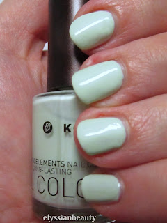
35 – Pastel Mint: a greyed yellow-leaning mint, not a chalky pastel, and I was quite surprised that it did not give me lobster-hands. Unfortunately my camera decided I should have them anyway, so don’t be disheartened by the way it looks in the pictures. It needs three thin layers for full opacity. It doesn't apply as nicely as the rest of the colours, but that's a universal pastel problem I think.
38 – Bright Mint: a goddess amongst my many mint polishes which is why I have included it in my giveaway. It has the Korres golden sheen, but it does register as gold at certain angles. A cool mint that is opaque in 2 layers.
90 – Pale Green: I have so much love for this one! It’s a smooth grey-green cream that applies like a dream. I would call it Misa’s Dirty, Sexy, Money’s lighter cousin. Perfect in two layers.


83 – Denim Blue is one of those polishes where the first layer applies too light and you think it’s going to need another two at least, but with the second layer it’s fully opaque and you’re left wondering how this magic happened. It’s somewhere between a navy and a midnight blue. In the bottle you can see a silver sheen, but not on the nail. It also didn't stain at all and since I wore it recently I can tell you it lasted a full five days without a top coat and had no chips or anything.

79 – Metallic Purple is not metallic at all, not in the traditional sense. It is a very red-leaning purple with a complex blue with pink particles flash. It’s like you’re wearing Venetian glass to be honest, it has that luminescent quality without an obvious metallic sheen. This is also going to be in the giveaway.
96 – Paradise Green: when I wore this colour I felt like a mermaid in the winter. It’s a teal base with green shimmer that depending on the angle can look almost teal. It was very difficult to photograph it and I wasn’t 100% successful. There is a very slight VNL with 2 layers, but not enough to necessitate a third layer.

I have to say that since I took this pictures I bought another 3 on a sale! They will certainly appear here in the future. So, what did you think of them? Any of them got your attention?
xxx
Elysse.

Saturday, 28 November 2015

Korres Nail Colour Mega review - part1 (picture heavy)

I had reviewed a nail polish by Korres in the past, but since then my collection has grown a lot which is a testament to how fond I am of them. After I finish presenting all 21 of them I will finally announce my first giveaway.Yay


Some general points about these polishes:
  • They are perfect for those looking for more muted tones. Their more winter colours have a characteristic and unmistakable muted quality to them which makes even the more unusual colours look very chic and wearable.
  • They are 7- free, i.e. they contain no silicone, acetone, phthalate, formaldehyde, camphor, tuolene and xylene. Their smell is really inoffensive, there’s hardly any of it. They also contain myrrh extract, provitamin B5, and oligoelements.
  • Each bottle contains 11ml and the brush is medium sized and flat, not as bit as an O.P.I. brush, more like an Etude House one.
  • Their formula feels different to other polishes, they are easy to control, apply very smooth and level very well. They don’t tend to pool at the sides at all even when I applied a thick layer (see the yellow below).
  • They are easy to remove and do not stain the nail.
  • All pictures were taken without a top coat.

All of them were bought with my own money. You can find more of them at the company website (non-affiliated link).

47 – Apricot: in the bottle in looked more pastel, but it a dries a little darker, to very cute apricot colour. It’s a cream that levels nicely when applied and requires 3 thin layers for full opacity.
13 – Sweet Pink: a salmon pink with the familiar silver sheen. It feels very romantic and autumnal. Opaque in two layers.
34 – Pastel Lemon: as with most yellows, this is applies a bit patchy. It’s the only one of the lot that I had any problems with though it was fine with 3 layers. It also has a sheen put it’s completely undetectable.
The golden sheen is apparent in the bottle, on the nail it's a different story.
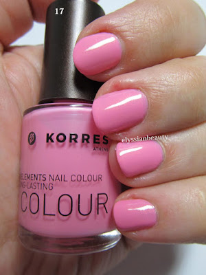
17 – Candy Pink: the most appropriate name for this vibrant blue toned pink. It has a slight golden sheen that is very typical of Korres’nail polish, but in this case it is not really visible on the nail. It needs three thin layers to reach full opacity.
22 – Flashy Fuchsia: again, a very correctly named colour. It, too, has the golden sheen only in this case it is more visible, but not distracting from the colour. It’s in the same family of colours as Essie’s Rose Bowl, only this is a deeper vibrant colour. Opaque in two layers.
51 – Tempting Coral: this is a jelly-like (a crelly maybe?) polish with the same golden sheen. The sheen is not visible as a golden colour, it just makes the polish more vibrant. A very summery colour, deeper and more orange than both Ciaté Mistress and Snatch and with the same type of opacity. Even with 3 layers on I can detect a VNL, but I still like it for its juicy look.


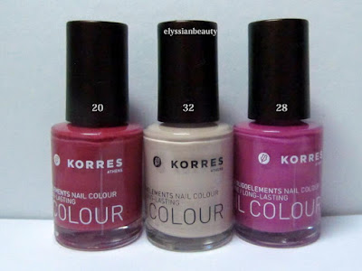
20 – Pink Azalea: a muted berry pink. Perfect in 2 coats and super smooth to apply. There’s also a deeper and redder version of this that I saw in the shop the other day and I know I need to get that, too.
28 – Disco Purple: Another colour that makes you think of the late 70s disco craze. I can’t help but think that this is a nod to the classic YSL Fuchsia. It’s a medium pinky orchid with a pink flash. Opaque in 2 coats.
32 – Light Mocca: this one has a silver sheen, too, but it’s almost undetectable even in the polish. It’s just there so that this beige colour won’t look flat. Three layers for full opacity.
33 - Metallic Sand: a light/medium sand colour. It has a light silver sheen to it that is visible when the light hits it. A good work-safe colour. Opaque in 3 layers.
65 – Metallic Bronze: a medium and rather cool bronze colour. It applied a bit streaky, like metallics do some times. It is such a pigmented colour that you could get away with single coat, though I obviously did two for the swatch.
61 – Metallic Taupe: a silver-brown taupe. 61 is not as streaky as in looks in the picture and it looks more brown under natural light. Opaque in 2 layers. 

I love both 61&65 cause they have a very vintage feel to them with 61 being the late 70s Bianca Jagger in studio 54 kind of colour and 65 being early 80s Crystal Carrington from Dynasty type of colour, equally unique in my collection as colours and textures. 

That's it for today. Tomorrow it's going to be all about the cool colours!
XxX
Elysse

Thursday, 2 April 2015

who Know's if the Moon's

who knows if the moon's
a balloon, coming out of a keen city
in the sky-filled with pretty people?
(and if you and i should

get into it, if they
should take me and take you into their balloon,
why then
we'd go up higher with all the pretty people

than houses and steeples and clouds:
go sailing
away and away into a keen
city where nobody's ever visited, where

always
            it's
                  Spring) and everyone's
in love and flowers pick themselves


I love this e.e. cummings poem so much. It feels so light and fresh, you’d never guess it was written 90 years ago.

The first sign of spring round where I live is the almond blossoms that suddenly appear at the end of January. They come so early that sometimes I can’t tell straight away whether the branches are covered in flowers or snow. This design was part stamped (Konad m66 plate) and part hand-painted. The base coat I used is Nailtek Foundation III and the top coat is Seche Vite.


base colour: Korres – 82 Ciel
branches: Le Chat CM – 4 Brown
flowers: Konad White, Korres – 17 Candy Pink, Essie – Plumberry
iridescent accents: Misa – Radiant

xxx
Elysse


Related Posts Plugin for WordPress, Blogger...