The autumnal equinox is this Wednesday
which marks the official end of the summer and the start of autumn. I know everybody
gets excited about autumn, but where I live it’s a bit impossible to be excited
about autumn in the middle of July in the midst of a heat wave. Today is
probably the first day that feels a bit autumnal here, chilly enough for a
jacket and still pretty much sunny.
Alligator Purse (613) is one of the unsung heroes of autumn by
Essie. It is now part of the permanent line thought it first came out in 2007, before the
nail blogging world exploded making certain shades iconic and our list of ‘must-haves’
longer and longer. On the website it is described as: “this luxurious creamy
burnt orange polish is the perfect couture accessory and your favorite(sic) new
arm candy.”
To me it looks like a brownish red which it
brings to mind 70s films like ‘Last Tango in Paris’ with its heavy orange hues.
It dries a couple of shades darker than it looks in the bottle and when the
light hits it it looks almost brick red. It’s a perfect autumnal shade!
I shall leave you with a beautiful song by
Dusty Springfield about the end of the summer. I hope we all have a great autumn!
I really felt like doing something freehand
this year for Christmas and I wanted it to be sparkly as well. Morgan Le Fay, a
beautiful shimmering polish, over black was my starting point and then I added
little colourful details here and there.
direct sunlight
artificial light
artificial light
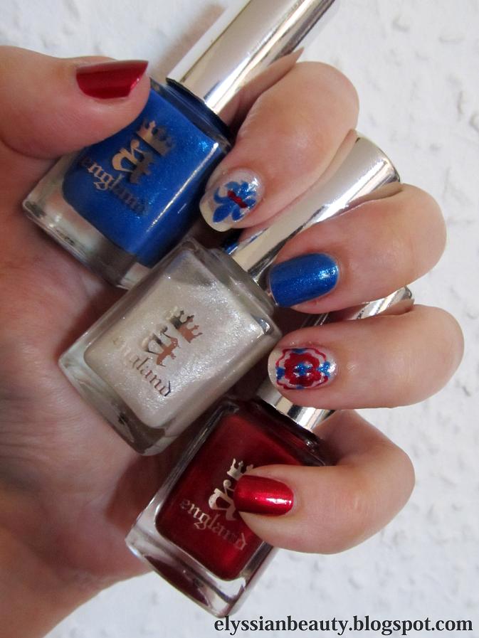
All polishes used for this manicure are from
A-England (non affiliated link)
Base: Camelot
Designs: Morgan Le Fay, Perceval, Order of the Garter, Holy Grail (old version)
Top coat: The Shield
I hope you all have a Merry Christmas/
Happy Holidays! XxX Elysse
Amidst all the Christmas merrymaking and due to a friend of mine my mind wandered off to Santorini.
artificial light. Can any of the beauty geeks recognise the back of this book?
direct sunlight
I used Mavala-167-Cyclades Blue as a base since you can't get more cycladic than Santorini, then I used Korres 82 Ciel in the central part of the nail and I painted the ribbon with what proved to be a really nasty acrylic paint that kept bleeding everywhere so I went on top of it with Ciaté Snatch 039 to make it smoother and a bit more vibrant.
Let this be a cautionary example for us all: never use anything for the first time if you're going to be seen in it or make a post about it. I always follow this rule and the one time I didn't chaos ensued.
The discovery of King Tutankhamun's tomb in 1922 had a huge impact all over the world. The tomb was almost intact and the findings were so rich and beautiful that the newspapers were full of news on the subject. Even now when we think of Egypt one of the first images that comes up is the golden mask of Tutankhamun. Add to that the 'curse of the Pharaos' and the audience was captivated!
Such an event influenced the fashions of the day as one would expect. With that in mind I was examining the pictures of the artefacts from the tomb to find patterns on them that one can find in 20s clothes, jewellery and decorative items. Ancient Egyptian style without the hieroglyphics if you like. Can you spot them on the items?
The base colour is the most royal of golds, A-England - Holy Grail (the original formulation) and the blue on the middle finger is LeChat CM - Navy. The rest were done with acrylic colours and all topped with Seche Vite which unfortunately cause some major shrinkage at the tips.
This is my 2nd day entry for the Lazy Days of Summer challenge, my summer ombre. Summer should ideally be hot so I chose hot, fiery colours for my ombre.
I did cheat a little bit though as I used three nail polishes instead of two. The red(thumb) is Creative Nail Design #431 House of Rebels, the orange (middle) is a custom mix I created last year when orange polishes were not as popular and the yellow is from Etude House.>
The pictures came out a bit funky coloured and I have no idea why. I tried to correct the colours a little bit, but I kind of like it. It looks a bit retro!
Dear reader,
I suggest you press play and let your mind wander far far away to a land of myths, folklore and legends, the land that A-England draws inspiration from.
As I mentioned in yesterday's post, I purchased the Jubilicious set of polishes from a-England and today I am going to be reviewing them. There's going to be plenty of pictures, a lot of descriptions and a lot of love in this post.
The Jubilicious set includes Order of the Garter (originally from the Legend collection), Morgan Le Fay and Perceval(originally from the Mythicals collection). Deciding to get these was quite a risk for me as I don't easily like shimmer polish and metallic reds are were a big no-no for me. I have another couple of their polishes which I absolutely adore and I knew I would love Order of the Garter, so I took the plunge and I am so glad I did. I can't stop looking at my nails!
I also overcame another pet peeve of mine by using different base colours for a mani. I like stamping and designs, but accent nails and different coloured nails(e.g. skittle, ombre manicures) usually make me feel very uncomfortable; not so much this time. The designs I chose to do are emblematic of the UK, a fleur-de-lys and a Tudor rose; I know Tudor roses usually have 5 petals which would have been difficult for me to do, but I found a reference for four petalled ones.
As always, I didn't practice before attempting this. Every time I want to do a difficult design that I should practice drawing at least one of twice before attempting it on the nail, a Californian voice in my head says "Duuude, life's too short! It's time to rock'n'roll!" and I just go straight at it.
OoG, MLF, P natural light
All of them have the buttery, applies-itself quality that they've become famous for. What I came to love more about them though is their uniqueness. A lot of thought has gone into them and that is something most apparent when you're dealing with shimmer polishes. Shimmer in a polish changes the colour quite dramatically and the colour and pigmentation of the base can make a shimmer fly or die. I'm happy to say we have some amazing fly-ers here!
Order of the Garter (OoG) was the only one I was certain I would like. Its gorgeous blue colour and subtle blue-green shimmer made me go back again and again to the website trying to decide whether I should get it or not. I'm glad I waited and got this set in the end. OG's base colour, surprisingly, is not a clean-cut blue, but a light greyish blue, a periwinkle that leans more blue than violet. It's not very pigmented and requires 3 thin coats for full coverage, but that is a very good thing in this case as the light base allows the shimmer to show through from all 3 layers thus getting a gloriously complex blue polish! Oh, and it doesn't give you lobster hands in case anyone is worried.
Morgan Le Fay (MLF, only one letter short of 'milf' which the legendary Morgan probably was) is a sheer shimmery topcoat. When used on its own you'd probably need 4 coats at least for a not-so-visible nail line and it will look whitish shilverish with tiny occasional flashes of pink and green. When used over another polish, somehow it looks frosty light blue. To recap: when you want to have fairy like fingertips, use it on its own; when you want Ice Queen fingertips, layer it over a darker polish.
Perceval (P), the one I thought I was not going to like, but became my favourite of the set. As I mentioned before, I don't like metallic reds; they are too Alexis Colby for my taste and I already have a metallic red I regretted buying in the past. Perceval is a horse of a different colour though and most of my pictures failed to capture it accurately; it's not a true red, or a vermilion like the legendary Perceval's armour was supposed to be. It has purple in it and it's one of those polishes that appear darker on the edges, 'lit from within'. Frankly, as soon as I applied it, it reminded me of a crimson rose; it has that amazing rich rose colour that changes with every angle and a soft velvet look. As if that's not enough to love it, in low light settings it has a certain glow about it which makes it even more amazing. I throw my glove at anyone who thinks Perceval is 'just another red'.
If you managed to read through this post, bravo! You must be a knight of NI! Now for the pictures.
Ps-I think I will fall victim to Jubilove after all. If I had it. the fleur-de-lys would have had a Holy Grail line across instead of red, and the rose would have a Holy Grail centre. Merlin would have to wait for his turn. Why didn't I think of that earlier?
Natural Light
Direct sunlight
Direct sunlight with flash
Direct sunlight
Mine! Mine! Mine!
Thumbs up for MLF looking blue over black matte
Base colours are more true to life in this. Perceval I love you!
On the sample you can see how OoG evolves with 1,2 and 3 layers. The '4' is irrelevant.
... the postman brought in this morning!! The A-England Jubilicious set from the Jubilee Delights! I will be reviewing and swatching them later, but the weather is so nice, I couldn't resist snapping a shot!
In case you are wondering they are (left to right): Perceval, Morgan le Fay and Order of the Garter.
You can get either these or the Jubilove set in the special sale price from their website (free worldwide postage!)
PS- Had I bought the Jubilove set, I would have been compeled to have a title as cheesy as "And they called it Jubilove", post this along with it and then you'd be singing that sappy tune in your head all day! mwahaha!
The Maneki Neko (招き猫), the Welcoming Cat is a common Japanese sculpture, often made of ceramic, which is believed to bring good luck to the owner. Each cat has a different meaning according to colour.
I think I making an introduction to my posts the melodic way, so here's some Olga Guillot for your pleasure.
One of the presents I received these days-today actually, but I'm trying to play it cool like I didn't 'aww' when I saw them- was O.P.I.'s Dutch Treat Minis with 4 mini bottles from the Holland Spring 2012 collection. I wasn't planning on getting any to be honest, not because they don't look nice, but because they don't look too different from colours I already have. I still might get Gouda Gouda Two Shoes because I can't resist a goldish aged pink and I have nothing similar. Much as I would love to have all the hues and versions of colours I love, I've decided to be rational; if it's not different enough for a non-colour addict to tell them apart, I won't get it, i.e. no Thanks a WindMillion for me since I have these.
Nail polish is nice, all cosmetics are nice, but (a)they have an expiration date (polish, eyeliners and mascaras 'die' so soon!) and (b)they tend to look dated after a few seasons since textures and colours change dramaticaly over time. They become better and better with much fewer harmful chemicals over time which is good. Enough with the rant though, here we go!
(natural light, shade)
The colours included in the collection are:
I Have a Herring Problem
Pedal faster Suzi!
Kiss Me on My Tulips
Red Lights Ahead...Where?
(sunlight)
I Have a Herring Problem is a beautiful medium dusty blue-green colour with glass flecks in, much like the ones in Orly - Pixie Dust, only Pixie's are silver and varied in size while Herring's are blonde gold and more symmetrical. On the nail there isn't significant difference between the flecks since the yellowish tone is cancelled out a bit by the blue. The flecks are more visible in Herring because the base colour is darker, but the ones in Pixie shine more when light hits them due to the larger flacks.They are most definitely not dupes, but they are in the same family. It would be interesting to see whetherI Have a Herring Problem's sister colour in the collection, I Don't Give a Rotterdam!, is a dupe to Pixie Dust. Both are light blue greys, but I suspect Rotterdam is more blue while Pixie is more grey.
(natural light, shade)
The next ones are a bit blurry to show you how Pixie is shinier and how the difference between blonde gold glass flecks and silver glass flecks is not that big.
(sunlight)
(sunlight)
And a close of the flecks:
O.P.I. - I Have a Herring Problem
Orly - Pixie Dust
UPDATE: I had a chance to check I Don't Give a Rotterdam! myself and it's much much bluer than Pixie Dust and they have different flecks. I still prefer Pixie Dust to be honest. I like the flecks better.
Next is Pedal faster Suzi!, a blue/lavender-toned pink with glass flecks just like Herring's, only silver. I really liked it when I saw swatches of it, but I didn't like it as much when I saw it today and even less on me. The colour is just wrong for me, it make my fingers look yellow and sickly. I have nothing similar to compare it with which is probably why I forgot to take pictures of it on its own. Oh well.. NEXT!
Kiss Me on My Tulips is a pretty bright pink. I don't usually go for pinks as you might have noticed, but this one looks ok. I found a colour that I thought would look similar to is, Essie - Bachelorette Bash. It turns out they are not all that similar and when I read their colour descriptions I had a revelation. KMoMT is a bright pink whilst BB is a 'creamy, juicy fuchsia': so there is a difference between bright pink and fuchsia! I always thought they were the same colour, but as I said, bright pink is really not my thing. Maybe on a hot summer's day I'll indulge in these. That's where they belong in my mind!
Last, but not least, is the colour I though I was going to dislike and never want to wear because it's too bright; Red Lights Ahead...Where?. Actually it took me by surprise how fun and flattering it was on! Even better, it only needed 2 coats for full opacity which was a blessing as the two colours I have that were closest to it were an application nightmate. Ciaté - Mistress was too orange and Ciaté - Snatch more red and jelly-like. RLAW can stand on its own in a salmon-infused red happy universe!
I've missed the decorative motifs in the old buildings at home in Athens (Greece) and I wanted to create something quite earthy, ceramic looking, like a decorated tile.I really wanted this to be matte because I prefer the natural matte surface of ceramics to the polished one; they feel more primitive in a nice way. By touching their rough surface you realize that you're touching a piece of moulded soil and it is as beautiful as it is simple.
Base colour: Etude House - WH708 (greige)
Stamping colour: Olay - Terra
And of course Manglaze - Matte-astrophe to complete the look.
By now it is a well established fact: we all love the Duochrome colours by Nubar. They are beautiful and if anything, describing them as 'duochromes' undermines their beauty as there are more than two colours that they shift to and from.
What I noticed when I saw them all together was how similar they all looked in their bottles. It was hard to tell them apart which was rather odd given that they look very different on the nail. Upon swatching them I realised why; most of them have the same multi-chrome shimmer in them that shifts from a light green to a bright pink and the only reason they look different on the nail is because they have a different base colour!
That of course is not true of all the duochromes, but of the ones I have the ones that have this green-yellow-pink shimmer are Indigo Illusion, Purple Beach, Moon Eclipse (new name for Moonshadow), Iris Dust and Wildlife. The only one that has a different kind of shimmer is Gold Leaf which has a kind of shimmer that doesn't shift so much but goes from gold to bronze.
I have swatched them on white paper first to make the difference of the base colours more apparent. It also lets the shimmer separate a bit from the base colour and it shows through a bit better that it does on the nail. After the paper swatches I swatched them on my nails. I thought it would be useful to anyone who might want to see them compared all together. It was a bit hard to make all five catch the light in the same way and therefore show a similar colour shift, but I made an honest effort! Also, I haven't included Gold Leaf in most of them since it is quite different.
And now, the pictures! As always, the pictures are larger if you download them
The colours are:
Nubar - Gold Leaf (GL)
Nubar - Moon Eclipse (Moon Shadow's new name) (ME)
Nubar - Indigo Illusion (II)
Nubar - Purple Beach (PB)
Nubar Iris Dust (ID)
Nubar - Wildlife (W)
The base colours (artificial light)
(artificial light)
(artificial light)
(artificial light)
(artificial light)
(artificial light)
(artificial light)
(artificial light)
For the nail swatches, I did 3 coats of all of them apart from Iris Dust that needed 5 coats.