Showing posts with label colour Silver. Show all posts

Saturday, 28 November 2015

Korres Nail Colour Mega review - part1 (picture heavy)

I had reviewed a nail polish by Korres in the past, but since then my collection has grown a lot which is a testament to how fond I am of them. After I finish presenting all 21 of them I will finally announce my first giveaway.Yay


Some general points about these polishes:
  • They are perfect for those looking for more muted tones. Their more winter colours have a characteristic and unmistakable muted quality to them which makes even the more unusual colours look very chic and wearable.
  • They are 7- free, i.e. they contain no silicone, acetone, phthalate, formaldehyde, camphor, tuolene and xylene. Their smell is really inoffensive, there’s hardly any of it. They also contain myrrh extract, provitamin B5, and oligoelements.
  • Each bottle contains 11ml and the brush is medium sized and flat, not as bit as an O.P.I. brush, more like an Etude House one.
  • Their formula feels different to other polishes, they are easy to control, apply very smooth and level very well. They don’t tend to pool at the sides at all even when I applied a thick layer (see the yellow below).
  • They are easy to remove and do not stain the nail.
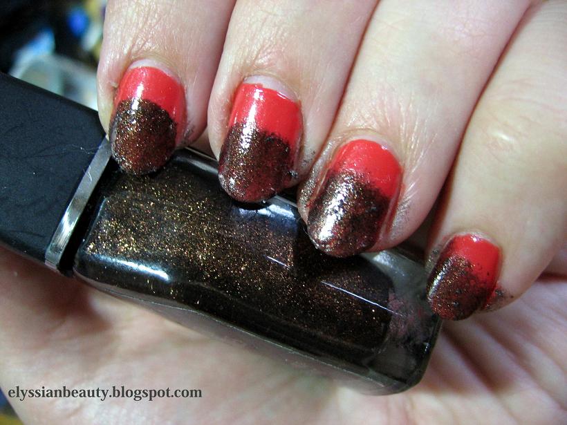
  • All pictures were taken without a top coat.

All of them were bought with my own money. You can find more of them at the company website (non-affiliated link).

47 – Apricot: in the bottle in looked more pastel, but it a dries a little darker, to very cute apricot colour. It’s a cream that levels nicely when applied and requires 3 thin layers for full opacity.
13 – Sweet Pink: a salmon pink with the familiar silver sheen. It feels very romantic and autumnal. Opaque in two layers.
34 – Pastel Lemon: as with most yellows, this is applies a bit patchy. It’s the only one of the lot that I had any problems with though it was fine with 3 layers. It also has a sheen put it’s completely undetectable.
The golden sheen is apparent in the bottle, on the nail it's a different story.
17 – Candy Pink: the most appropriate name for this vibrant blue toned pink. It has a slight golden sheen that is very typical of Korres’nail polish, but in this case it is not really visible on the nail. It needs three thin layers to reach full opacity.
22 – Flashy Fuchsia: again, a very correctly named colour. It, too, has the golden sheen only in this case it is more visible, but not distracting from the colour. It’s in the same family of colours as Essie’s Rose Bowl, only this is a deeper vibrant colour. Opaque in two layers.
51 – Tempting Coral: this is a jelly-like (a crelly maybe?) polish with the same golden sheen. The sheen is not visible as a golden colour, it just makes the polish more vibrant. A very summery colour, deeper and more orange than both Ciaté Mistress and Snatch and with the same type of opacity. Even with 3 layers on I can detect a VNL, but I still like it for its juicy look.


20 – Pink Azalea: a muted berry pink. Perfect in 2 coats and super smooth to apply. There’s also a deeper and redder version of this that I saw in the shop the other day and I know I need to get that, too.
28 – Disco Purple: Another colour that makes you think of the late 70s disco craze. I can’t help but think that this is a nod to the classic YSL Fuchsia. It’s a medium pinky orchid with a pink flash. Opaque in 2 coats.
32 – Light Mocca: this one has a silver sheen, too, but it’s almost undetectable even in the polish. It’s just there so that this beige colour won’t look flat. Three layers for full opacity.
33 - Metallic Sand: a light/medium sand colour. It has a light silver sheen to it that is visible when the light hits it. A good work-safe colour. Opaque in 3 layers.
65 – Metallic Bronze: a medium and rather cool bronze colour. It applied a bit streaky, like metallics do some times. It is such a pigmented colour that you could get away with single coat, though I obviously did two for the swatch.
61 – Metallic Taupe: a silver-brown taupe. 61 is not as streaky as in looks in the picture and it looks more brown under natural light. Opaque in 2 layers. 

I love both 61&65 cause they have a very vintage feel to them with 61 being the late 70s Bianca Jagger in studio 54 kind of colour and 65 being early 80s Crystal Carrington from Dynasty type of colour, equally unique in my collection as colours and textures. 

That's it for today. Tomorrow it's going to be all about the cool colours!
XxX
Elysse

Monday, 8 April 2013

Retropolish: Seventeen Super Shine #471

I thought I'd create a special tag for my older polishes that may or may not be discontinued. I'll kick off this journey through my collection with a Greek polish by the company Seventeen (nothing to do with the UK 17 brand). These polishes unfortunately don't have names, only numbers, but they have an near infinite variety of colours. No 471 is a bit tricky to describe as depending on the light it looks from purplish to steel. It doesn't shift like a duochrome, the change in colour is much more solid with this one as you can see in the pictures. So pretty!
natural light (shade)
incandescent light

Wednesday, 25 July 2012

Andrea Fulerton - Mischa

One of my recent purchases is this beautiful polish, Andrea Fulerton - Mischa. I have to admit, nailblogging has changed my tastes a bit and now I am more open to trying out different textures. A year ago I would have picked this up, looked at it, perhaps admired it and then promptly reject it as a 'glitter'.

Truth is I love it though. It's complex, it's easy to remove (I'm always worried about that with glitters) and it's a beauty. The base is a greyish blue as you can see in the paper swatch photo and it's packed with asymmetric microglitter in gold, gunmetal and blue, but you do catch glimpses of other colours as well. It applies nicely and I did three coats for this swatch. Depending on the light it can look anything from light metallic blue to deep gunmetal Unfortunately the edge suffered a bit of shrinkage due to the Seche Vite I used.
natural light(overcast)
indoors
close up on the nail
basecolour
close up of the paper swatch under incandescent light
You can also see it on Eva Green where it was used for her recent InStyle (Uk) photoshoot.

Friday, 17 February 2012

If chaos looks lovely...

...surely it can't be bad! After wearing Mavala - Platinum Marble for a couple of days I had had enough of the pearl shine; shimmer tires me quickly I'm afraid. I filed my nails and since the polish was still in a good shape I decided to give it another chance. Out come my two trustees, Manglaze  - Matte is Murder (matte black) and Fuggen Ugly (matte gorgeousness), and taraaa! Beautifully chaotic mani! I loved the feel of it, especially on the second day when it became smoother, but was still matte. It looked amazing! Excuse the dry hands. The weather is so cold at the minute, it's almost impossible to keep them hydrated no matter what I use. 
 (natural light)
  (natural light)

(artificial light)

Monday, 6 February 2012

Comparison: Stamping with Stargazer Chrome Polishes

I really like using Stargazer Chrome Polishes for stamping, evident by the fact that I got them all, and I wanted to do this comparison between them for a friend. I hope this explains the ugliness of the mani. I was trying so hard to find designs that would make both chrome colours apparent, yet not cover either of them too much that I didn't even notice how incompatible the designs are till after I did it! I guess I was too caught up in the details to notice the 'big picture'! Haha!

The base colour is Essie - School of Hard Rocks and the Chrome polishes are: 
232 - silver (the one I think is best and reach for most of the time)
233 - silvery blue chrome
234 - pinky chrome
235 - violet purple chrome
236 - deeper blue chrome
237 - gold (this is not that great on light and medium colours, but works best on dark as you can see here  and here).

You can find all of them here.


(all pictures were taken under artificial light)

Saturday, 29 October 2011

This is Halloween


Halloween is on Monday and it's fnally time to use the Halloween-themed designs on the Bundle Monster plates. I also decided to attempt a gradient nail using a sponge. I think it's ok for a first try!

The colour I used as a base was a jelly orange I made (or frankened as people tend to call these polishes) last year that I was craving for a jelly orange to match my favourite lip-gloss. It also saved me from buying O.P.I.'s Texas collection's jellies that came out a little bit later.
For sponging I used
1 layer of Oil of Olay - 680 Shimmering Sable (dark brown base with a bronze shimmer)
2 layers of Nubar  - Dark Castle (darkest grey with a metallic sheen) and 
1 layer of Seche Vite Dry Fast Top Coat

This is a picture I took with only the brown polish sponged on. 

After everything was nice and dry I used StarGazer Chrome 232 (silver) for stamping.


A few days earlier I had attempted to do another similar mani over ManGlaze's Matte is Murder, but the StarGazer Chrome 237 (gold) wasn't bright enough over black. Oh well.. It's still fantastic over other colours!

Happy Halloween!


Related Posts Plugin for WordPress, Blogger...