This is one of the oldest comparisons I haven't published since the pictures were taken back in April so excuse the dry cuticles and not very smooth application. I wanted to get Mavala - 251 Cedar Green and Mavala - 247 Mosaic Blue for some time and when I finally got them, I discovered they were exact dupes of colours I already owned, O.P.I. - Here Today...Aragon Tomorrow and Ciaté - 3 am. Girl respectively. All four polishes are great and there's really minimal differences between them.
Mavala - 251 Cedar Green andO.P.I. - Here Today...Aragon Tomorrow are very dark greens. Both require 3 coats for full opacity, though they always retain a certain jelly-ness. Both have a small amount of shimmer in that is barely noticeable in the bottle, but keeps the polish from looking too flat on the nail. The only difference I noticed was that when used for stamping, Cedar Green's pigmentation was smoother.
Mavala - 247 Mosaic Blue and Ciaté - 3 am. Girl are midnight blues, both require 3 coats for full coverage and, like the previous couple, they have a certain jellyness to them without being true jellies. Mosaic Blue has a bit of the shimmer like the other two, whilst 3am.Girl doesn't. Again the only marked difference was when I used them for stamping where Mosaic Blue is a little bit darker.
I'm so sorry for being absent for almost two weeks, but I've been having such a nightmarish time with blogger and Google Friend Connect! I couldn't make them work at all and after trying out a million different things, they just went back to normal as if nothing had happened.
I couldn't even enjoy the first time I've ever been featured on another blog! The Driveler Kate from one of my favourite blogs, drivel about frivol, featured me along with other great bloggers in this post. Thank you so much Kate for the feature and your kind words! I really loved the idea of the Liebster Awards and I've been around to look at some of the features, though of course GFC wouldn't let me follow any at the time *ugh*. I will have a look around again though! I also see I have some new followers; hello new followers! I will in time do my own nominations for the Liebster award, but for the time being I have a comparison for you that I'd prepared ages ago.
Mysterious Curse, Royal Velvet, 317, Natural Light.
Check out the colour shift of the shimmer on the StarGazer bottle!
Along with Buried Alive, I also ordered Mysterious Curse from the Orly Dark Shadows collection. I could tell it was somewhat similar to another polish I had from the Spring 2011 collection, Royal Velvet, I just wasn't expecting them to be almost identical. So, here is a comparison I did between those two and another similar polish,Stargazer 317 version 1.
All three have a deep purple base with a lot of fine shimmer in that shifts from bright pink, to blue. The pink shift is actually a lot stronger than what you see in my pictures, but my camera consistantly fails to capture it. They are practically dupes and their only differences are:
*Orly Royal Velvet is much less pigmented than the other two (requires 4 coats at least as opposed to 3) and harder to apply. It's a pooling nightmare as you can see in the pictures.
*Both the Orly polishes left behind red staining in spite of using a base coat.
*Stargazer 317 has a lot more shimmer in and a slightly darker base colour. It is also more pigmented, you could get away with only 2 coats of it if you're careful.
Mysterious Curse is a better polish than Royal Velvet as it is more pigmented and more manageable, but I can't help being very dissappointed in Orly who came out with -practically-the same polish twice in a year. If the Stargazer 317 was easier to find, I would undoubtedly point you to its direction as it is much better and a lot cheaper at the same time. What a shame it's not!
Paper swatch along with some more colours, natural light
One coat/ 3 coats, artificial light
First coat
Natural light
Artificial light
Artificial light and as much of the pink shift as my camera could capture.
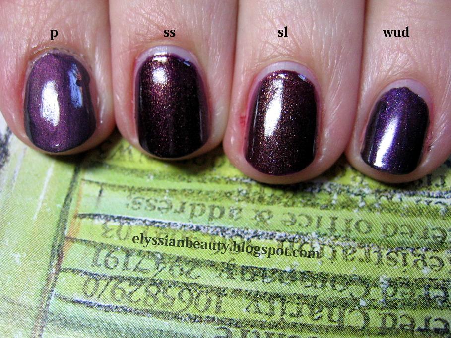
I have reviewed Ciaté's Strictly Legal in the past, but had failed to notice how similar it is to China Glaze's Side Saddle. This is why I need to make these comparisons, because I am always drawn to similar colours and textures and end up having too many dupes or near dupes which is the case with these. As always with comparisons I try to take as many pictures as possible.
Both are very pigmented and opaque in 2 coats and have exactly the same type of shimmer that shines mainly gold, but you can see reflections of pink and green as well. It's been very popular these years and it seems to be a type of shimmer you can find in a lot of nail polishes and cream eye shadows as well.
However, the base colour is slightly different. Side Saddle has a deep purple base whilst Strictly Legal is a beautiful burgundy. Both are equally dark with respect to lightness making them hard to distinguish on the nail. The one thing that is different on the nail is the way the shimmer looks. It's a lot more golden and apparent on Strictly Legal, SL looks like a polish with shimmer while in Side Saddle the shimmer is not as apparent giving it that 'lit from within' look.
All in all, they are very similar and close to being called dupes. They are not twins, they are sisters.
Bottle swatches (artificial light)
(artificial light)
(artificial light)
Side Saddle, Strictly Legal and Ciaté Wait Until Dark (artificial light)
I also thought it would be useful to compare them with another two colours, Nubar - Prevail (with a topcoat) as it is, too, a purple with hints of gold and Ciaté Wait Until Dark since it is another popular Ciaté purple, but as you can see it is not a true purple but a grey base with a lot of purple shimmer.
Bottles (natural light, shade)
Natural light (shade)
Natural light (gloomy british daylight)
Natural light (gloomy british daylight)
These last two are blurry to showcase how the shimmer looks different in the two polishes
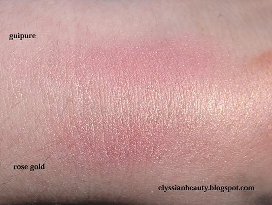
Ever since Sleek came out there's been a lot of fuss around their products for being good in spite of their low price. I was in Superdrug yesterday and I though I'd give the blushers a try.
Rose Gold is their most famous colour for being a dupe of Nars - Orgasm and having that peachy-pink colour that is universally good (=for all skin colours) and the golden sheen that is very fashionable these days. I also noticed there was a similar colour in one of the new Blusher By 3 palettes, Lace (367), Guipure. Guipure is softer as a colour and peachier than Rose Gold, but they both have the same amount of sheen to them. Both are very pigmented and soft, but unfortunately I am not at all keen to this much sheen in any blusher. I like a more natural-but-better look and I always think that products that are terribly 'in' and duped left and right at any one point will make pictures and videos one might take look so terribly 'old fashioned' after a while, so I think I'll pass.
Here's a few swatch pictures for those of you who might be interested. All of them were take under natural mid-day sunlight with varying degrees of light/shadow.
Some time ago I found this pretty little multichrome, W7 - Metallic Mars. Lulled away by the beautiful colours I could see in the bottle, I took it to the counter straight away and failed to notice how similar it is to Nubar - Iris Dust. My dislike of having similar colours was not as fast as my 'pretty colours-must have' impulse, which was also assisted by the minimal price of £2. All that is of course to your benefit since I get to do this comparison so you don't have to be fall into the same trap I did. I added Moon Eclipse (former Moon Shadow) in the comparison just for reference.
Open the pictures as a new tab if you want a closer look, all the pictures are taken under natural light. Let the madness begin!
The verdict
Nubar Moon Eclipse is different enough, so I am going to focus on the other two. Consistency-wise Metallic Mars requires 3 layers while Iris Dust 4-5 for full opacity. Both colours have the same type of tiny shimmer particles I spoke about here, however, W7 Metallic Mars'base is a warmer tone than Nubar Iris Dust. When they are showing the pinkish colour, Iris Dust looks a tiny bit cooler than MM and when they are showing the golden colour, Metallic Mars looks bronzier. Frankly, even side by side you can see the differences are minimal, they are close enough to be considered dupes and I don't think you need both.
I think I making an introduction to my posts the melodic way, so here's some Olga Guillot for your pleasure.
One of the presents I received these days-today actually, but I'm trying to play it cool like I didn't 'aww' when I saw them- was O.P.I.'s Dutch Treat Minis with 4 mini bottles from the Holland Spring 2012 collection. I wasn't planning on getting any to be honest, not because they don't look nice, but because they don't look too different from colours I already have. I still might get Gouda Gouda Two Shoes because I can't resist a goldish aged pink and I have nothing similar. Much as I would love to have all the hues and versions of colours I love, I've decided to be rational; if it's not different enough for a non-colour addict to tell them apart, I won't get it, i.e. no Thanks a WindMillion for me since I have these.
Nail polish is nice, all cosmetics are nice, but (a)they have an expiration date (polish, eyeliners and mascaras 'die' so soon!) and (b)they tend to look dated after a few seasons since textures and colours change dramaticaly over time. They become better and better with much fewer harmful chemicals over time which is good. Enough with the rant though, here we go!
(natural light, shade)
The colours included in the collection are:
I Have a Herring Problem
Pedal faster Suzi!
Kiss Me on My Tulips
Red Lights Ahead...Where?
(sunlight)
I Have a Herring Problem is a beautiful medium dusty blue-green colour with glass flecks in, much like the ones in Orly - Pixie Dust, only Pixie's are silver and varied in size while Herring's are blonde gold and more symmetrical. On the nail there isn't significant difference between the flecks since the yellowish tone is cancelled out a bit by the blue. The flecks are more visible in Herring because the base colour is darker, but the ones in Pixie shine more when light hits them due to the larger flacks.They are most definitely not dupes, but they are in the same family. It would be interesting to see whetherI Have a Herring Problem's sister colour in the collection, I Don't Give a Rotterdam!, is a dupe to Pixie Dust. Both are light blue greys, but I suspect Rotterdam is more blue while Pixie is more grey.
(natural light, shade)
The next ones are a bit blurry to show you how Pixie is shinier and how the difference between blonde gold glass flecks and silver glass flecks is not that big.
(sunlight)
(sunlight)
And a close of the flecks:
O.P.I. - I Have a Herring Problem
Orly - Pixie Dust
UPDATE: I had a chance to check I Don't Give a Rotterdam! myself and it's much much bluer than Pixie Dust and they have different flecks. I still prefer Pixie Dust to be honest. I like the flecks better.
Next is Pedal faster Suzi!, a blue/lavender-toned pink with glass flecks just like Herring's, only silver. I really liked it when I saw swatches of it, but I didn't like it as much when I saw it today and even less on me. The colour is just wrong for me, it make my fingers look yellow and sickly. I have nothing similar to compare it with which is probably why I forgot to take pictures of it on its own. Oh well.. NEXT!
Kiss Me on My Tulips is a pretty bright pink. I don't usually go for pinks as you might have noticed, but this one looks ok. I found a colour that I thought would look similar to is, Essie - Bachelorette Bash. It turns out they are not all that similar and when I read their colour descriptions I had a revelation. KMoMT is a bright pink whilst BB is a 'creamy, juicy fuchsia': so there is a difference between bright pink and fuchsia! I always thought they were the same colour, but as I said, bright pink is really not my thing. Maybe on a hot summer's day I'll indulge in these. That's where they belong in my mind!
Last, but not least, is the colour I though I was going to dislike and never want to wear because it's too bright; Red Lights Ahead...Where?. Actually it took me by surprise how fun and flattering it was on! Even better, it only needed 2 coats for full opacity which was a blessing as the two colours I have that were closest to it were an application nightmate. Ciaté - Mistress was too orange and Ciaté - Snatch more red and jelly-like. RLAW can stand on its own in a salmon-infused red happy universe!