Showing posts with label colour Yellow. Show all posts

Wednesday, 10 August 2016

Catch some pastel stars


It had been quite some time since I had done nail art of any sort, but the other day I met up with some friends, had a totally girlie day of pampering and playing with beauty products. By the time I got back I felt really inspired to do something playful and here it is, a stamping design that owes a lot to Sanrio’s Little Twin Stars.


My nails are shorter than usual at the moment which meant I could use a design from the Bundle Monster BM20 plate. The pastel yellow base is Korres’ 34 – Pastel Lemon and for stamping I used various mixes of: 
China Glaze – Secret Peri-wink-le
China Glaze – For Audrey
China Glaze – Flyin’High
Orly – Cashmere Cardigan
Essence – 117 Happy End
Speaking of stars, tomorrow and the day after (11&12/08) the  Perseids Meteor Shower will be at its peak. Do you plan on staying up and watching the falling stars? Here’s a link to read more about it if you like.
XxX
Elysse


Saturday, 28 November 2015

Korres Nail Colour Mega review - part1 (picture heavy)

I had reviewed a nail polish by Korres in the past, but since then my collection has grown a lot which is a testament to how fond I am of them. After I finish presenting all 21 of them I will finally announce my first giveaway.Yay


Some general points about these polishes:
  • They are perfect for those looking for more muted tones. Their more winter colours have a characteristic and unmistakable muted quality to them which makes even the more unusual colours look very chic and wearable.
  • They are 7- free, i.e. they contain no silicone, acetone, phthalate, formaldehyde, camphor, tuolene and xylene. Their smell is really inoffensive, there’s hardly any of it. They also contain myrrh extract, provitamin B5, and oligoelements.
  • Each bottle contains 11ml and the brush is medium sized and flat, not as bit as an O.P.I. brush, more like an Etude House one.
  • Their formula feels different to other polishes, they are easy to control, apply very smooth and level very well. They don’t tend to pool at the sides at all even when I applied a thick layer (see the yellow below).
  • They are easy to remove and do not stain the nail.
  • All pictures were taken without a top coat.

All of them were bought with my own money. You can find more of them at the company website (non-affiliated link).

47 – Apricot: in the bottle in looked more pastel, but it a dries a little darker, to very cute apricot colour. It’s a cream that levels nicely when applied and requires 3 thin layers for full opacity.
13 – Sweet Pink: a salmon pink with the familiar silver sheen. It feels very romantic and autumnal. Opaque in two layers.
34 – Pastel Lemon: as with most yellows, this is applies a bit patchy. It’s the only one of the lot that I had any problems with though it was fine with 3 layers. It also has a sheen put it’s completely undetectable.
The golden sheen is apparent in the bottle, on the nail it's a different story.
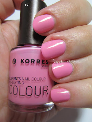
17 – Candy Pink: the most appropriate name for this vibrant blue toned pink. It has a slight golden sheen that is very typical of Korres’nail polish, but in this case it is not really visible on the nail. It needs three thin layers to reach full opacity.
22 – Flashy Fuchsia: again, a very correctly named colour. It, too, has the golden sheen only in this case it is more visible, but not distracting from the colour. It’s in the same family of colours as Essie’s Rose Bowl, only this is a deeper vibrant colour. Opaque in two layers.
51 – Tempting Coral: this is a jelly-like (a crelly maybe?) polish with the same golden sheen. The sheen is not visible as a golden colour, it just makes the polish more vibrant. A very summery colour, deeper and more orange than both Ciaté Mistress and Snatch and with the same type of opacity. Even with 3 layers on I can detect a VNL, but I still like it for its juicy look.


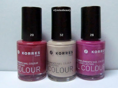
20 – Pink Azalea: a muted berry pink. Perfect in 2 coats and super smooth to apply. There’s also a deeper and redder version of this that I saw in the shop the other day and I know I need to get that, too.
28 – Disco Purple: Another colour that makes you think of the late 70s disco craze. I can’t help but think that this is a nod to the classic YSL Fuchsia. It’s a medium pinky orchid with a pink flash. Opaque in 2 coats.
32 – Light Mocca: this one has a silver sheen, too, but it’s almost undetectable even in the polish. It’s just there so that this beige colour won’t look flat. Three layers for full opacity.
33 - Metallic Sand: a light/medium sand colour. It has a light silver sheen to it that is visible when the light hits it. A good work-safe colour. Opaque in 3 layers.
65 – Metallic Bronze: a medium and rather cool bronze colour. It applied a bit streaky, like metallics do some times. It is such a pigmented colour that you could get away with single coat, though I obviously did two for the swatch.
61 – Metallic Taupe: a silver-brown taupe. 61 is not as streaky as in looks in the picture and it looks more brown under natural light. Opaque in 2 layers. 

I love both 61&65 cause they have a very vintage feel to them with 61 being the late 70s Bianca Jagger in studio 54 kind of colour and 65 being early 80s Crystal Carrington from Dynasty type of colour, equally unique in my collection as colours and textures. 

That's it for today. Tomorrow it's going to be all about the cool colours!
XxX
Elysse

Tuesday, 17 September 2013

Flowers from Korea

A few months ago a dear friend of mine went to Korea. She’s one of those people that wherever she goes pleasant surprises happen and they are the stuff we talk and laugh about for years. I wonder what stories she’ll have to share when she comes back from her travels later this week. Along with her amusing stories she also brought back a ton of presents, some of which you will be seeing eventually. Not the chocolates, though. Those are already gone.

One of those presents was a colourful cosmetics bag. I love unusual combinations of colours, and this is definitely a winner combination. It’s one of those combinations that when you hear about it, it sounds like it wouldn’t work, but then you see it and it’s beautiful, vibrant, it makes your day just looking at it! I aim to become brave enough to combine colours that way. 


Something that beautiful of course had to be translated to a mani and here is my attempt, along with the colours I used to achieve it. I chose the plum tree pattern from the Konad plate m66 as the fabric has a similar embossed floral pattern, though you can’t see it in the pictures. The colours I used were (thumb to pinky):

Essie – 563 Bachelorette Bash
Butter London – Dosh
Orly – Everything’s Rosy
OPI – Kyoto Pearl 
Bourjois – 39 Jaune Trendy
Nails Inc – 050 Tower Bridge (for stamping)


Thursday, 2 August 2012

Dotting tool fun with Etude VIP Girl polishes

The seventh challenge in the Summer Challenge is Dotting Tool Summer Fun and fun I had. I really enjoyed making something this colourful. I don't usually use this many bright colours, but I really felt like making something cheerful today so out came my dotting tools along with the VIP Girl collection from Etude House and this is what I made!
Here is the full collection. Aren't they the cutest? From left to right they are: YL802, GR605, PK011, BL505 and PK012

XX


Wednesday, 18 July 2012

My Summer Ombre: Red to Yellow

This is my 2nd day entry for the Lazy Days of Summer challenge, my summer ombre. Summer should ideally be hot so I chose hot, fiery colours for my ombre.

I did cheat a little bit though as I used three nail polishes instead of two. The red(thumb) is Creative Nail Design #431 House of Rebels, the orange (middle) is a custom mix I created last year when orange polishes were not as popular and the yellow is from Etude House.>

The pictures came out a bit funky coloured and I have no idea why. I tried to correct the colours a little bit, but I kind of like it. It looks a bit retro!

Friday, 1 June 2012

Drk-A, Westside Warrior and Crop Circles

I've had China Glaze - Westside Warrior for the longest of times and hadn't worn it for some reason so I decided it was about time. It's actually a very nice polish, maybe a little too yellow-leaning for me to love it (I have Foubert's place for that), but the texture is nice and it applies smoothly in two coats.

I also decided to go one step beyond and do the 'dreaded' accent nail for which I used  Bourjois 39 Jaune Trendy and Westside Warrior as a stamping polish using a design from my beloved Drk-A palette. WW is actually fantastic for stamping as it is very pigmented. I really liked the end result, it looks like a field with crop circles!
Artificial light

Tuesday, 29 May 2012

Barry M Blue Moon and Some Daisies


I finally got the Drikk Drk-A plate! Yay!! I had wanted that plate since I first saw it because I find the desings much more to my liking than other sets. I will review the plate in dew time, when Drk-B gets here,too. For those of you who are interested in them, it used to be that you had to fill in a google doc to get it straight from the makers in Brazil, but the people at Ninja Polish have made both the Drk-A and the Drk-B plates easily accessible from their website. I ordered from overseas and it only took 6 working days to get here!

I started with a happy little design since it's been so hot these days. It's the first true spring/summer pastel I've worn in a long time, but the cuteness of the design helped the transition. 
The base colour is Barry M - Blue Moon (np317). I can't say I liked it very much as a texture I'm afraid. It proved a little difficult to work with, but I guess that's what happens with most pastels. In the bottle it has a blue sheen, but that's not apparent on the nail at any point. 
Then I used the beautiful Mavala - Cyclades Blue (167) to get the daisies on and with a dotting tool I added yellow dots here and there.

I hope you're enjoying the good weather!

Friday, 18 May 2012

A bit of sunshine: Bourjois 39 Jaune Trendy

Ανάρτηση στα ελληνικά
I am so tired of this November weather. I really needed something sunny and playful and since I can't make a quick escape to somewhere warmer and sunnier, I settled for a sunny colour on my nails with a bit of stamping to make it more interesting.

The base colour is Bourjois 39 Jaune Trendy, a lovely warm mustardy yellow that is rather goopy and I think I should add a few drops of thinner before I use it next time.

Then I put nail guides on to limit the design on the top third of the nail only and stamped it with Konad White stamping polish using Bundle Monster plate BM21. I finished it of with dots of greens and blues. From thumb to pinky they are: OPI - Jade is the New Black, China Glaze - For Audrey, China Glaze - Flyin'High, W7- Stellar, China Glaze - Aqua Baby.
Natural light (overcast)

Saturday, 31 March 2012

Nubar Toasted Marshmallow with a 70s Twist

As I said before, Nubar - Toasted Marshmallow has become a favourite not so much because it's a great colour on its own, but because I have been looking for this colour for designs I want to do. Here is the first one in a style that is full of late 70s nostalgia, a time where this sort of yellow along with brown and warm red was very fashionable - or at least that is the impression we are left with. Of course I added a Carpenters song to match the mood!


The breakdown
Base colour: Nubar - Toasted Marshmallow (2 coats)
Stamping polish: Le Chat Cm - 04 Brown Nail Art Polish
Plate: Konad m65
No topcoat.

I decided not to use a topcoat with this but instead take advantage of the matte finish that this brown polish has and add some texture to the mani even if it meant it wouldn't be as long lasting.

Friday, 23 March 2012

Nubar Spring 2012: Toasted Marshmallow

In the Nubar Spring 2012 Jellybeans collection Toasted Marshmallow (NJB263) was considered by some the least wanted colour. Well, I'm most definitely not one of them; when I saw it, it was a 'halleluja' moment! I have been looking for a colour like this for so long that I had to get it as soon as possible. It's been with me for the last month and I've been using it for so many manicures that you will grow tired of seeing! Haha! Before I start the madness though, here is the colour itself.

I would describe it as a muted goldenrod yellow, like you mixed a bit of brown to dampen the goldenrod a little bit. It is not the most amazing colour on its own, especially not on fingers like mine where I have a lot of red pigment on my fingtips, but it doesn't make them look bad. It's not giving me lobster hands like a green would, a problem I've had with similar colours that have green in them. It's a subtle, easy to wear 'confiture de lait' colour.


Thursday, 16 February 2012

Red Veined Leaves & Cool Jazz

How do you feel about red veined leaves? I love them.

Base colour H&M - Wanna Pepperoni 1 coat only - how great is that!
Stamping Polish Bourjois - 21 Cerise Noir 
Nail Plate A20 (bought from this  seller but more sellers have been listing these plates since)

Tuesday, 24 January 2012

Nubar Duochromes Swatches Galore (picture heavy)

By now it is a well established fact: we all love the Duochrome colours by Nubar. They are beautiful and if anything, describing them as 'duochromes' undermines their beauty as there are more than two colours that they shift to and from. 

What I noticed when I saw them all together was how similar they all looked in their bottles. It was hard to tell them apart which was rather odd given that they look very different on the nail. Upon swatching them I realised why; most of them have the same multi-chrome shimmer in them that shifts from a light green to a bright pink and the only reason they look different on the nail is because they have a different base colour!

That of course is not true of all the duochromes, but of the ones I have the ones that have this green-yellow-pink shimmer are Indigo Illusion, Purple Beach, Moon Eclipse (new name for Moonshadow), Iris Dust and Wildlife. The only one that has a different kind of shimmer is Gold Leaf which has a kind of shimmer that doesn't shift so much but goes from gold to bronze.

I have swatched them on white paper first to make the difference of the base colours more apparent. It also lets the shimmer separate a bit from the base colour and it shows through a bit better that it does on the nail. After the paper swatches I swatched them on my nails. I thought it would be useful to anyone who might want to see them compared all together. It was a bit hard to make all five catch the light in the same way and therefore show a similar colour shift, but I made an honest effort! Also, I haven't included Gold Leaf in most of them since it is quite different. 

And now, the pictures! As always, the pictures are larger if you download them
The colours are:
Nubar - Gold Leaf (GL) 
Nubar - Moon Eclipse (Moon Shadow's new name) (ME) 
Nubar - Indigo Illusion (II) 
Nubar - Purple Beach (PB)
Nubar Iris Dust (ID)
Nubar - Wildlife (W)


The base colours (artificial light)
 (artificial light)
 (artificial light)
 (artificial light)
 (artificial light)
 (artificial light)
 (artificial light)
(artificial light)
For the nail swatches, I did 3 coats of all of them apart from Iris Dust that needed 5 coats. 
 (natural light)
 (natural light) 
 (natural light) 

  (natural light) 
 (natural light) 
 (natural light) 
 (natural light) 
 (natural light) 
 (natural light)

Related Posts Plugin for WordPress, Blogger...